In this article, we will be covering a range of topics about the colors yellow and gray and some ideas on how we can use this for our art practice this year. We will look at art journaling as therapy and Pantone's Color of the Year. Lastly, we'll explore color palettes in paintings by Picasso, Van Gogh, and two awesome ZenARtists from our community-Petro Konstantynov and Salvatore Fidone.

Yellow and Gray: Pantone Colors of the Year 2021
In December 2021, to everyone's surprise, Pantone once again announced two "Color of the Year" for 2021. If you're a visual artist, an interior, graphic or fashion designer who's been following all of Pantone's colors of the year, you'll know that this is the second time the leader in color language selected a pair for the year. The first time was when they named PANTONE 13-1520 Rose Quartz and PANTONE 15-3919 Serenity the color of the year 2016. Rose Quartz and Serenity are meant to blend into each other, a balance between a warm pastel rose pink and cool calm blue reflecting the acknowledgement of gender equality and fluidity.

"A marriage of color conveying a message of strength and hopefulness that is both enduring and uplifting." -Pantone
This year is the color of yellow and gray. Pantone announced PANTONE 13-0647 Illuminating and PANTONE 17-5104 Ultimate Gray as 2021's color or should we say "colors" of the year. Unlike 2016's color pair, 2021's Illuminating and Ultimate Gray are two independent colors that highlight how different elements come together to support one another.
We may say that this year's colors are indeed greatly influenced by the happenings of the year 2020. As more and more people look for ways to reinforce themselves with the much-needed energy and clarity to overcome the continuing uncertainty, bright and spirited shades might just inspire us to hope and move on.
"The selection of two independent colors highlight how different elements come together to express a message of strength and hopefulness that is both enduring and uplifting, conveying the idea that it's not about one color or one person, it's about more than one. The union of an enduring Ultimate Gray with the vibrant yellow Illuminating expresses a message of positivity supported by fortitude," said Leatrice Eiseman, Executive Director of the Pantone Color Institute.

Using symbolism to explain how one might visualise these colors, Pantone described Illuminating as a "bright and cheerful yellow sparkling with vivacity, a warming yellow shade imbued with solar power" while the Ultimate Gray is "emblematic of solid and dependable elements which are everlasting and provide a firm foundation. The colors of pebbles on the beach and natural elements whose weathered appearance highlights an ability to stand the test of time, Ultimate Gray quietly assures, encouraging feelings of composure, steadiness and resilience."
What exactly is Pantone?
Pantone colors are color codes that stand for a specific accurate shade--colors that can be communicated precisely using the Pantone code. Simply put, Pantone is another standard language for colors developed by the company Pantone in the 1960s.
Standard Language for Colors
These color codes and names have been used for decades by designers to communicate accurate colors to their team, their clients and the printing companies. Though it's widely used in graphic, interior and fashion design, here are two ideas we visual artists can use.
Idea #1 Naming your artwork
Use it to put a title to your artwork! Are you used to labeling your paintings "Untitled" in exhibit title cards? Why not add color names or codes to their titles? This is also perfect for abstract paintings. Write down this idea and you might just be able to use it someday.
Idea #2 Create a collection using a coded palette as inspiration
Create a 3, 4 or even 5-piece series or collection of paintings. Claude Monet created around 250 predominantly blue-hued paintings for his Water Lilies series, meanwhile, Vincent van Gogh created his yellow Sunflowers series.

Decades of Pantone Colors
Pantone started in the early 1950s as a small printing company in New Jersey, USA. In 1956, its founders, both advertising executives, hired Lawrence Herbert who later in 1962 purchased the company's technological assets and renamed them, Pantone. In 1963, Pantone introduced the Pantone Matching System-a color communication system with 500 colors. In the next two decades, Pantone successfully established themselves as the graphic arts industry standard for the color specification extending their library of colors to 747.

In 1983, Pantone established the Pantone Color Institute-their arm specifically focused on color consulting and trend forecasting aimed to help designers and brands "harness the power of color." It was the year 1999 when Pantone announced Cerulean Blue as their first-ever "Color of the Year" for 2000, the color of the millennium.
Yellow Art Journals to Lift the Spirits Up
Getting the ideal life we want requires real work and tracking progress seem to be an insurmountable task that overwhelms our creative souls. Sometimes it's just too overwhelming-juggling our art practice, promoting our art plus the occasional creativity block whilst making sure our personal well-being is in top shape. It's important now, more than ever to engage in self-care and boost mindfulness, and we can start by journaling.

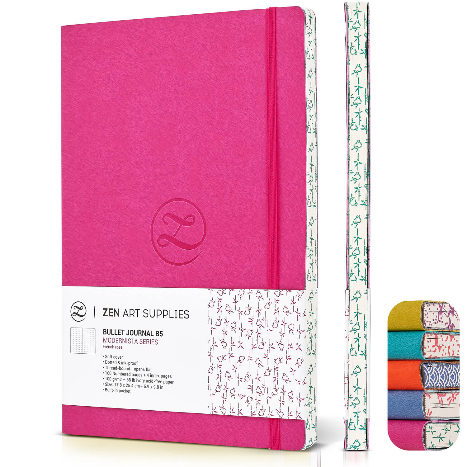
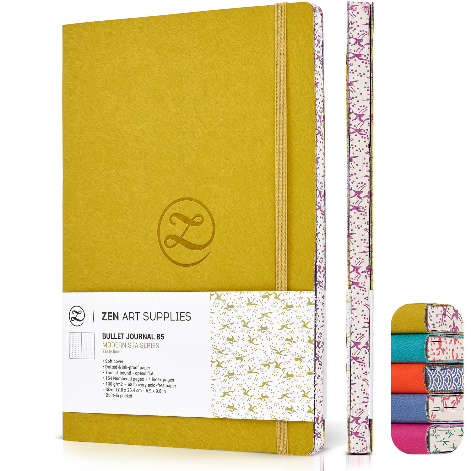
For our ZenART Bullet Journals, I was inspired to use the "colors of the year" from the past years and combine bright and spirited shades to include in our collection. For this year, why not uplift your mood with colors? Our vibrant Zesty Lime Art Journal will definitely give that lift, maybe inspire you to keep moving, keep creating. Read more about how journaling as therapy can lead to a better life.
Let's explore yellow and gray Pantone Colors in oil paintings.
Using color-matching tools available online, our team explored yellow and gray Pantone and hex codes in the paintings we selected for this section. Let's take a look at oil paintings from Pablo Picasso, Van Gogh, and ZenARTists Petro Konstantynov and Salvatore Fidone.
Guernica by Pablo Picasso


Pablo Picasso's most famous work, Guernica is also his most powerful political statement. Guernica depicts in devastating metaphor the sufferings of innocent civilians and animals during the war. Picasso painted Guernica as his reaction to the Nazi's bombing practise on the Basque town of Guernica in Spain during the Spanish Civil War. The use of greys in this monumental oil painting gave depth and intensified the drama and emotion. This gray, black, and white painting is 3.49 meters or 11 feet 5 inches tall and 7.76 meters or 25 feet 6 inches across.
Lemons by Petro Konstantynov


Wheatfield with Crows by Vincent van Gogh


Vincent van Gogh's Wheatfield with Crows is argued to be the artist's very last painting before his death. The iconic painting depicts a bright yellow wheatfield and looming over the landscape-turbulent dark cloudy skies filled with crows. In a letter he wrote to his brother Theo in July 1890 about his paintings, Vincent van Gogh mentioned that he made a point of "expressing sadness" and later adding "extreme loneliness" or "de la solitude extr^eme."
Portraits by Salvatore Fidone


Whichever oil paint color you choose to use more often this 2021, make sure to utilise them well by experimenting and trying out various color mixes. Read this comprehensive article on "Creating Fabulous Colors with Oils." Use grays to add depth and yellows to shine some vibrance to your pieces this year. Read our insightful feature "Color Yellow: What It Means and How Artists Can Utilise the Benefits for Their Artworks" to gather a multitude of ideas and maybe thank us later.
What do you think of this year's yellow and grey palettes? Share your thoughts below! Happy 2021!
- MEET THE AUTHOR-
Ardak Kassenova is a London based contemporary artist, co-founder and creative director of ZenART Supplies. Her visual style-contemporary impressionism-share similar aesthetic qualities with those by the French Impressionists. After 20 years of a successful corporate career, becoming a mother to two wonderful girls, and with the continuous development of her practice by taking private lessons from the best artists she could find; Ardak decided it's time to align her life with her true passion, Art. Driven by this passion and her corporate leadership background, she co-founded ZenART.
"My heart and soul were always with Art, and since my childhood as long as I remember myself, I was dreaming to be an artist. I was painting after work, when I had time, and teaching myself through the books, videos, visiting art galleries and museums. I've been very curious about different techniques and styles, and therefore accumulated knowledge and experience on a variety of mediums."
Read more about Ardak Kassenova in this feature. Say hello to @ardak_zenart on Instagram!
References
Pantone, https://www.pantone.com/about-pantone
Pantone Color Finder, https://www.pantone.com/color-finder
Artwork color match tool, https://www.ginifab.com/feeds/pms/pms_color_in_image.php
Van Gogh, https://www.britannica.com/biography/Vincent-van-Gogh/Legacy


