What is it? | Why do artists need it? | Making an artist color wheel step-by-step | RYB and CMY color systems
A color wheel (also called a color circle) is a circular arrangement of color hues organized into three levels and their relationship with each other – the primary, secondary, and tertiary colors. There are several different color wheels nowadays. Here, I’ll be focusing on the artist color wheel based on Johann Itten’s that deals with the classic color mixing theory and Albert Munsell’s modern color mixing system. I find it a very good foundation for artists to start from.

Getting to know the color wheel, how to mix various colors, and learning the different color theories are essential tools that will greatly aid any artist in their painting process.
Color has long been studied, debated, and speculated over. You’ll find studies by Chevreul, Von Bezold, Newton, Rood, Church, Munsell, and others if you want to have a deeper study of it. I personally like “Color Problems” by Emily Noyes Vanderpoel. It talks about color in layman’s terms with such great explanations and illustrations that didn’t leave me confused or lost.
What is the artist's color wheel?
Most color wheels use the trichromatic model where you have three primary colors of which three secondary colors are mixed, followed by another three tertiary (12 all). Some add more intermediaries amounting to 24 colors in total. Which three primaries exactly will always be a point of contention.
The most popularly used primary colors are based on the sensation of color that is first and foremost produced by light. Using a prism, the white light from the sun becomes a streak of colors called a spectrum. Sir David Brewster’s theory is based on this and was greatly popular with artists, the theory of three primaries – red, yellow, and blue. Mainly because of how easy it was to mix the secondary colors from the primaries, and the tertiary colors from then on.

But through time we have come to know that there are also differences between pigments, paints, and light that we have to take into account. For example: Through experimentation, green doesn’t show in blue or yellow light, only in white. And in red and green lights, you’ll see yellow. And so on with other colors under different lighting.
Nowadays, artists are divided between the traditional/classic color theory and the modern color theory. Modern color mixing is based on Albert H. Munsell’s color system where he takes into account the three properties of color: hue, chroma, and value. Based on his system, the colors Cyan, Magenta, and Yellow were designated as primaries. The same colors (plus black - the key color) that our printers are equipped with these days (CMYK).

I will not debate which one is right or wrong. For me, knowing both is the best thing to do, and from there you can decide on your own. I have found both to be equally useful. So I’ll do just that here and show you both artist color wheels. But first, let’s quickly go over these three below:
Hue
When it comes to color wheels/charts/models, it describes the main groups of colors based on the spectrum – red, orange, yellow, blue, violet, and so on. But you’ll find another usage of ‘hue’ in the labels of art supplies. In this case, hue means that another or other pigments were used in place of the originally known one. Like in the case of Cadmium Yellow Hue, it no longer contains the actual Cadmium Yellow pigment but instead another that is similar in color. But generally, artists use the word hue interchangeably with color.
Chroma
Chroma is the intensity or saturation of a color. It shows the range of colors from their pureness to varying levels of brilliance, neutrality, or how subdued they appear.

Value
This refers to the lightness or darkness of a color with black and white as comparisons at opposing ends of a scale.

Here is a wonderful diagram to help you visualize how the theory is applied to colors:

And here is what it looks like in a spherical-ish form with all the colors minus the cutout portion:

Why do artists use a color wheel?
Color wheels can help you decide on what colors to use for your paintings. You don’t ‘have to’ use one, but it will certainly help you decide on your color palette for each painting. You’ll also have more harmonious paintings at least color-wise. There are “color harmonies” that you can study and use as guides for your future works.
Color is a big part of your painting’s composition besides the subject choice and the placement of objects in the given space. Read more about the basic rules of composition to help you have an even better understanding of how they go hand-in-hand, plus some very useful composition tips and tricks.
How do you create a color wheel?
It’s fairly simple and you can have just a basic 12 color wheel. You can also try making a 24 colored one with more intermediary colors in the future. For this exercise we’ll use the RYB (red, yellow, blue) primary color selection first followed by the CMY (cyan, magenta, yellow).
RYB Primary Colors
Step 1
Draw a circle, you can find a circular shaped item at home and trace it. If you’re using oil, it’s best to do it on a primed surface whether it’s canvas paper, panel, canvas, or wood.
Step 2
Divide the circle into 12 equal segments. Think of a pizza but with 12 slices instead of the usual 8.

Step 3
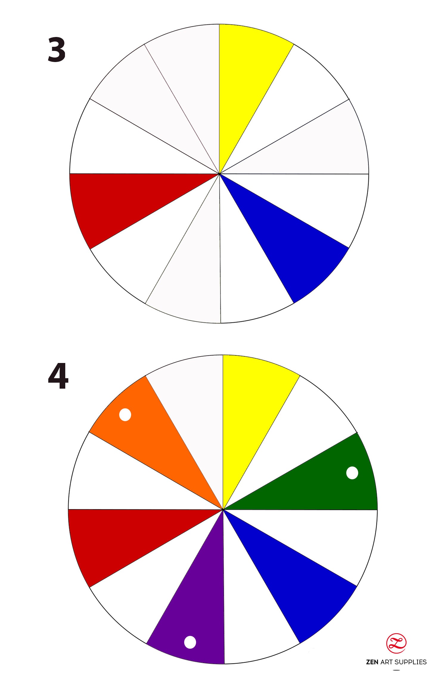
The first colors you’ll need to paint are the three primarily colors. Place them separate from each other with equal intervals - three pies apart.
Step 4
Then we start mixing the primaries to create the secondary colors. Mix the two colors nearest each other and place the new color between the two. There should be an empty pie on both sides of the new color. Do this for all the primaries next to each other.
Yellow + Blue = Green
Red + Blue = Violet
Yellow + Red = Orange
Step 5
Now fill the remaining pies with the tertiary colors. Mix the primary and secondary colors next to each other to create each tertiary color.
Yellow + Green = Yellow Green
Green + Blue = Blue Green
Blue + Violet = Blue Violet
Violet + Red = Red Violet
Red + Orange = Red Orange
Orange + Yellow + Yellow Orange
And your artist color wheel is now complete. This will serve as a great guide when you study the different color harmonies. We’ve got a very in-depth article covering that plus more about colors in Oil Painting Mixing Colors. The color theory and harmonies you’ll find there are applicable across all mediums, not just oil. I encourage you to explore them as they can really improve your color palette choices.

Color Harmonies
Here’s an example on how your artist color wheel can be used to help plan out the colors you will use. Read the article mentioned above to see examples of paintings by the masters following the various color harmonies you see below.

CMY Primary Colors
The steps will be exactly the same as the RYB artist color wheel above. You’ll just be using a different set of primary colors.
Step 1 & 2
Start with the circle and divide into 12 slices just like before.

Step 3
Place your primary colors (cyan, magenta, and yellow) equally spaced apart from each other, three pies in between.
Step 4
Mix your primaries that are next to each other on the color wheel to create the new secondary colors. Again, there must be an empty space on either side of each new secondary color you mix.
Cyan + Magenta = Blue
Magenta + Yellow = Red
Yellow + Cyan = Green

Step 5
To finish off your CMY artist color wheel, mix the primaries and secondaries next to each other to create 6 new tertiary colors.
Magenta + Red = Rose
Red + Yellow = Orange
Yellow + Green = Chartreuse
Green + Cyan = Azure
Cyan + Blue = Violet

Here’s a very thorough video from a great artist and ZenART Supplies’ brand ambassador, Ayna Paisley. In the video, she details how to create three color wheels using a different set of RYBs for each one. The idea behind the exercise is that there are different blues, yellows, and reds that can be used to create a full range of different colors.
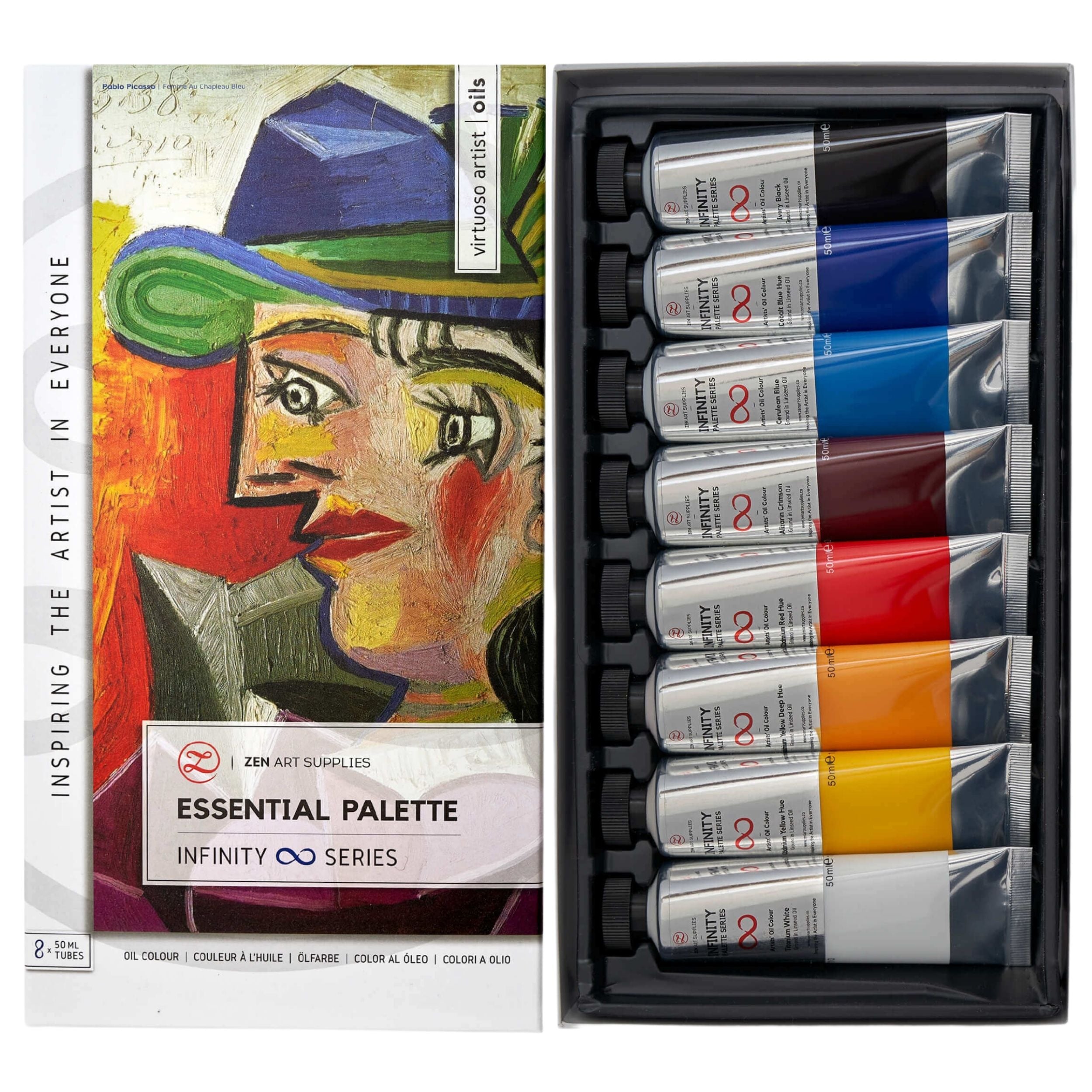
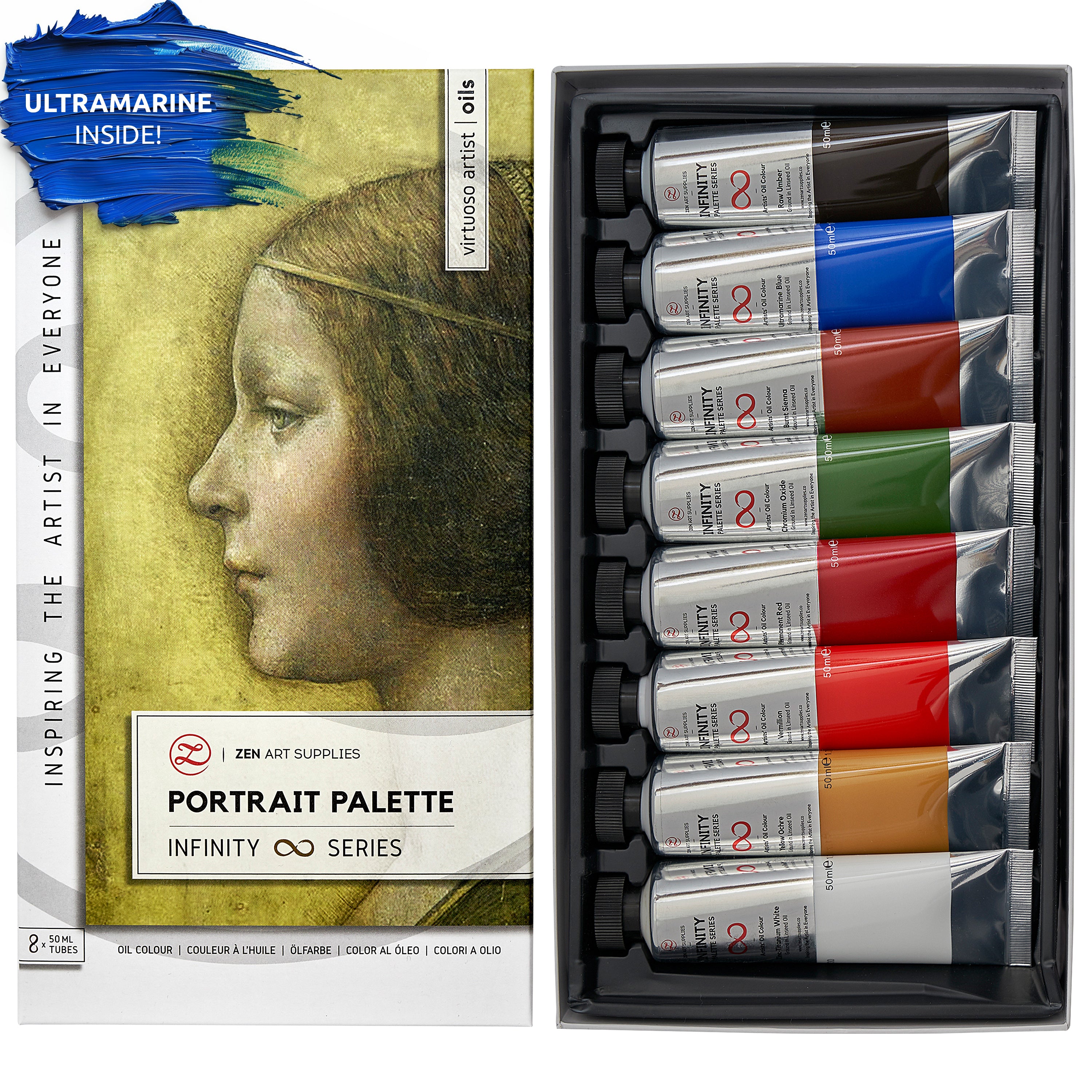
She used colors from ZenART’s Infinity Series of oil paint sets: Essential Palette, Impressionist Palette, and Portrait Palette. Watch the video to see how she goes about mixing and creating three artist color wheels!
And here’s mine but it’s still unfinished. I plan to add the tints (outermost of the wheel) and shades (inner) of each color as well so I’ll have an ultra handy guide.
I used the colors Cadmium Red Hue and Cadmium Yellow Hue from the Essential Palette and Ultramarine Blue from the Impressionist Palette. In the end I just went with the palette knife (from the Turner Collection) to mix and apply the oil paints. I didn’t use any solvent or medium and just used the paints straight out of the tubes. The upside to using a palette knife is that it’s much easier to clean between colors — just wipe the paint off with a paper towel or a rag!

Color wheels are fun to create and are quite useful to have around. You’ll be able to practice your color mixing and get to know your paints more intimately. Finding out which colors are more intense and learning how to temper the intensity down, when to use less and vice versa. After all, I believe that half of the painting process happens on the mixing palette.
I hope you found this useful and will encourage you to create your very own artist color wheel. It is a most enlightening experience that I’m sure you’ll enjoy!
We’d love to hear from you!
Have you made your own artist color wheel before? Which primary colors did you use? Have you tried making a different one for each medium you use? I’d love to hear back from you, let me know your thoughts in the comments below! Join our friendly art community Painting Inspiration Daily on Facebook. You can share your art and ideas, watch LIVE tutorials, and be inspired to paint!
Have fun creating and painting your own color wheel!
- MEET THE AUTHOR -

Kathleen is the Wordsmith at ZenART, resident artist and art editor. When God sent a shower of talents, Kathleen made sure she got a basketful of them! She's a visual artist with practical knowledge on various fields from painting and sculpture, to costume and set design which comes in very handy when writing about various art techniques and theories. She also shares her passion for the arts through teaching. She runs her own brand of handmade wirework jewelry designs.


