Color Theory Emotions | How Color Affects You | Colors and Emotions - The Evolution of Color | Color Emotions - The Inspiration of ZenART's Watercolors
Before jumping into the colors and emotions train, you might want to have a look at our previous Toolkit article - How To Watercolor For Beginners Tutorial. It's a great guide for beginners that covers the different materials you'll need and how to start using and exploring them.
TABLE OF CONTENTS: Looking for something in particular? Jump ahead using the links below:
Color Theory Emotions - From Newton To Wright
How Color Affects You
Colors and Emotions - The Evolution of Color
Color Emotions - The Inspiration of ZenART's Watercolors
Color Theory Emotions - From Newton To Wright
Listening to different kinds of music evokes different emotions in you, reading tragic stories and poetry make you sad, and seeing funny images can make you laugh. Color can also be used in the same manner, it can be a very effective tool when used right. Just look at the colors used for the stop lights - red, yellow, and green. Among the three, red is the most dominant and stimulating and it instantly catches your attention. In the case of the stop light, it means to STOP. While yellow is less stimulating than red, it's still bright and warm enough to signal as a kind of warning. To get ready to SLOW DOWN. And finally a medium shade of green that's not too bright nor too muted. Just the right amount of brightness to tell you that it's time to GO.

How we experience and respond to color changes depending on the shades and intensities used and the color combinations. Not to mention the personal, cultural, and psychological meaning they carry for each of us. The journey to a deeper understanding of color is nowhere near its end. But we are certainly going in the right direction.
Isaac Newton
What we know about color now stemmed from Sir Isaac Newton's discovery of the rainbow in 1666. Which he then turned into a diagram that we all know and learned in school - the color wheel. From there we find out that there are three primary colors that when mixed create another set, the secondary colors. And by mixing the primary and secondary, you create another set called the tertiary colors. By studying the placement of the colors on the color wheel and their relationship to each other, we learn to understand the theory behind the different color harmonies.

Perhaps the most commonly known one is the color harmony using Complementary Colors. Where two colors on opposite sides of the wheel are used side by side, to enhance and complement each other. For example when you use the colors red and green together, the red becomes even more vibrant and the green lusher. Think of fir and pine trees adorned with red d'ecor during the holidays, don't they just look great together? Knowing the different color harmonies you get from the color wheel and learning how to make use of them is an essential part of any artist's toolkit. Check out this article - Oil Painting Mixing Colors. For a more in depth look at the color wheel and color harmonies. The theories covered there remain the same for any medium.
Johann Wolfgang von Goethe
Color has long been a subject of mystery and debate. From scientists to artists, from philosophers to the average person on the street. While Newton studied color as something physical (what the eye could see), Goethe saw the emotional side of it. Wherein each one of us experiences and sees colors differently from each other. This different side of relating to color greatly intrigued him. Perhaps being a poet and a novelist had great influence in this. He went into great detail about how color may affect our emotions and behavioral traits, opening the doors to modern color psychology.

Carl Jung
Swiss psychiatrist and psychoanalyst Carl Jung was considered to be one of the prominent pioneers of color psychology. He believed color to be an essential tool in psychotherapy. Using the work of Hippocrates as his foundation, he divided the four different consciousness or temperaments into four personality types related to color. Specifically cool blue, earth green, sunshine yellow, and fiery red. His intention was to study and explain how color can be used and what its effects are. How they can reflect our inner motivations, psyche, and our behavior. Each color personality type has a positive and negative aspect, and we all contain a part of each of them just in varying amounts and proportions.
Bauhaus
Bauhaus (German for "building house") was a German art school founded by architect Walter Gropius known for its visionary way of bringing together arts, crafts, design, and mass industry in one unified association. The four notable proponents of the Bauhaus color theory are Johannes Itten, Wassily Kandinsky, Paul Klee, and Josef Albers. Their unique ways of interpreting and using colors greatly influenced the development of color theory emotions we use nowadays.
Wassily Kandinsky
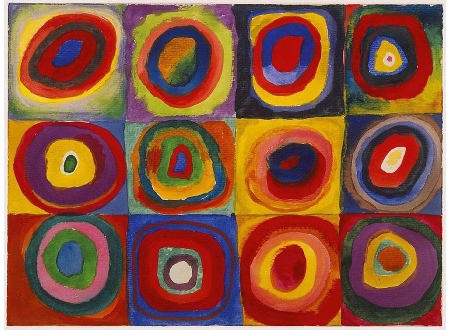
Kandinsky's color theory strives to explain how a painter's palette comes about. Either by the effect it has on the eye (how a person understands color on the physical level), or by its psychological effect - how it resonates and connects to the painter's spiritual experience.
"Color is the keyboard, the eyes are the harmonies, the soul is the piano with many strings. The artist is the hand that plays, touching one key or another, to cause vibrations in the soul."
Johannes Itten
Meanwhile Itten associates different colors with certain emotions, closely studying how colors affect mood, how each person perceives color, and how an artist's favored color palette reflects their personality. He gave us the color wheel we are most familiar with nowadays containing 12 colors (three primary, three secondary, and six tertiary). He also theorized seven types of color contrast and taught them to his students. They are as follows: contrast by hue, by saturation, by value (light to dark), by temperature, by complements, simultaneous contrast, and contrast by extension.

Angela Wright
Using Carl Jung's theories as stepping stones, Angela Wright pushed it even further and formed a color emotions theory merging color psychology and color harmony called the Colour Affects System. Below are the 7 principal tenets of that theory:
Color Affects System
- Each hue affects distinct psychological states.
- The psychological effects of color are universal.
- Every shade, tone or tint can be classified into one of four color groups.
- Every color will harmonize with every other color in the same group.
- All humanity can be classified into one of four personality types.
- Each personality type has a natural affinity with one color group.
- Response to color schemes is influenced by personality type.
She observed that the colors put together that also worked well psychologically also clearly had a kind of color harmony. Although people often mistake attributing their emotional reaction to just one color. But it's actually color combinations that trigger the reactions. Likewise in music, emotional response is only produced depending on how the musical notes are combined together.
How Color Affects You
Here are the four personality types according to the Color Affects System:
Personality Type 1 - Morninglight/Spring
Delicate warm colors that are clear, clean, and fresh. They contain very little to no black, and are high on the value scale. Think of spring with all its bursts of color and life after the long and cold dark winter months. The sunrise is bright and clear, the melting ice and snow return to running rivers that are so fresh and clean. Nature is coming back to life.
This personality reflects spring and the morning light - externally motivated and eternally youthful. People with this personality type are also light on their feet, often clever (but not the type who likes intense debates), and optimistic.
Because of the talent and tendency to handle a number of things at the same time, it can be negatively perceived as being frivolous, superficial, and insubstantial. Some may view such brightness and lightness as trivial and cheap. Emotions can become fragile.


Personality Type 2 - Dreamlight/Summer
Cool, delicate, subtle (not necessarily light) colors that contain a bit of grey with mid range values. As nature moves from spring to summer, the earth becomes drier and the leaves go from vibrant green to a darker and deeper green. This makes it a perfect complement to the softer colors of blossoming flowers. The intensity of the summer sun washes out the colors during sunsets and the heat haze of the noontime sun blurs out the surroundings. This constant warm temperature shows us how color affects you, and makes you yearn for rest and cooler environments.
This type of personality is cool, calm, collected, and internally motivated while still being sensitive to what others around them are feeling. They can be very witty, but often with a subtle and dry sense of humor. They have gentle, quiet elegance that doesn't make them seek the limelight.
The challenge for this personality is they might appear aloof and unfriendly to others. Especially since they try to avoid excitable situations that might put them under the spotlight.


Personality Type 3 - Firelight/Autumn
Colors that are rich, warm, kinda offbeat, and fiery that contain black tints in their mixtures but without black itself in the group. Autumn is the season where nature is filled with abundance, it is the time where fruits have ripened and are ready for harvest. The bright colors of the earth, the flowers, and leaves are now turning to burnt oranges and browns (of the leaves and not the flowers), rich golds, fiery reds, and purples.
This means being externally motivated, and having a strong and intense personality. Firelight personalities are fiery and strong and can be flamboyant, though the intensity will vary depending on the subordinate personality influences. If the subordinate is Dreamlight to a greater degree, then the fiery-ness is lessened.
This personality can be negatively seen as being too bossy or tedious.


Personality Type 4 - Starlight/Winter
Cold, clear, strong, either very light or very dark, and intense with deep and extreme contrasts including black and white. Snow has fallen and the landscape is blanketed with it, everything around appears white with the stark contrast of dark and leafless trees here and there. And the icy blue or cool grey sky as a cold backdrop. In this sense, the grey that we see during this time may seem like a sad color. All that was bright and colorful has now withered away, seemingly asleep yet there is energy as the regeneration process begins.
People with this personality type are internally motivated and automatically command respect. They are very efficient and precise in what they do, are not easily distracted from the objective, and don't want to take the time to explain in detail to others.
This may seem cold, uncaring, and somewhat elitist. Their challenge is to be more open and pay attention to what others are feeling.


Colors and Emotions - The Evolution of Color
The theories and debates surrounding color are in continuous evolution. From Newton's search for a deeper understanding of color to the color psychology that's heavily used nowadays in art therapy and the world of marketing. We have gone beyond using color merely for aesthetic or decorative purposes, we have learned that how we use it is an essential part of our lives and our wellbeing. The discovery of how each person relates to color is special to each individual through their own personal color association, the cultural or symbolic meaning, and the psychological meaning.
Personal Color Association
This is generally the conscious association we have with a certain hue, or tone of color, and the personal connection it has to us. Like the color of your favorite food, or something from your memories like your father's coat.

Cultural or Symbolic Meaning
This is the deep belief about color within one's own culture. Colors develop great symbolic meaning and significance through many generations, and may even become part of folklore.

Psychological Meaning
Whenever we see color, we instinctively react to it mainly on an unconscious level. Color is a universal language that we understand by instinct - the language of emotions - and it affects our behavior without us even consciously knowing about it.

The more we learn on how and why we react and relate to color, the better our understanding of how to make the right color choices and how we equate color and emotions. To be able to use color to create and achieve the positive results we are looking for.
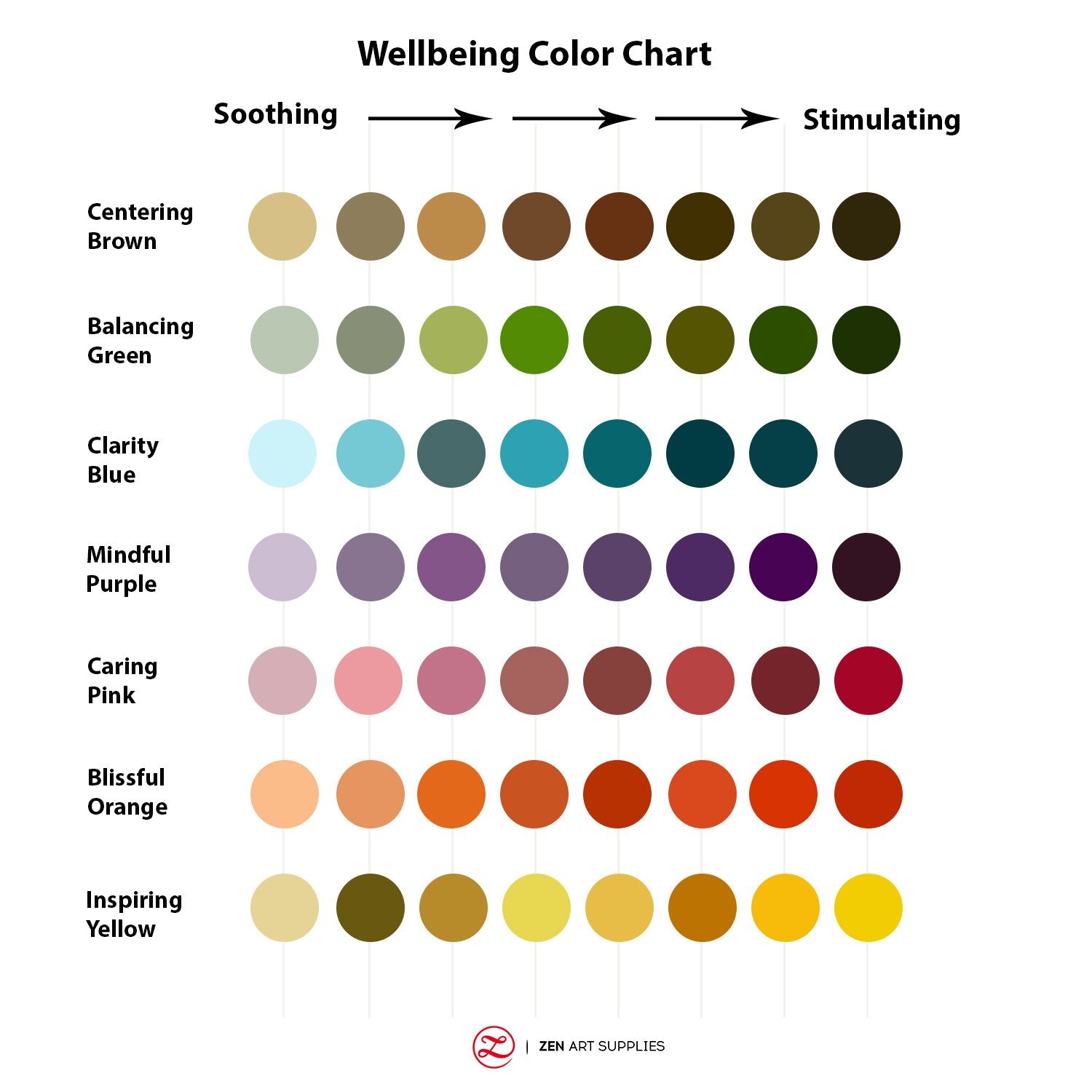
Each color has the ability to be either stimulating or soothing. It largely depends on its chromatic intensity. If the color is deeply saturated, it's more likely to be stimulating. If the color has low saturation, then it's highly likely to be more on the soothing side. Take blue for example, blues with intense and deep saturation stimulate and enliven the mind. While less saturated and lighter blues such as the sky are soothing and calming to the mind.
Color Emotions - The Inspiration of ZenART's Watercolors
Learning how to mix colors to create different color harmonies is an important skill that artists aspire to master. With those skills you can effectively use colors to elicit a certain mood or atmosphere in your works. Check out the useful guides, mixing charts, and tips in another of our Toolkit articles - How To Mix Watercolors - Essential Guide.

Our ZenART Watercolor sets are made especially for aspiring artists and students, these palettes have been designed to give you different choices according to the mood and the effect you want to portray. Based on our co-founder Ardak Kassenova's studies into the effects of color on our moods, mental wellbeing, and her long use of art as therapy. Our special tagline for these watercolor sets says it all - Paint with Colors of Your Mood. Take a look at the four sets below!
Espresso
This set is designed to promote the habit of daily painting, sketching, and journaling for a healthy mind and creative flow. It's small enough to fit in your pocket, making it the perfect set for bringing along when on the go. Just like its name - espresso - it's tiny but packed with a powerful collection of 12 super-colors. They're the essential colors for color-mixing the other colors you might need.


Allegro
The set that's packed with a bevy of warm colors, for those with a more outgoing and sunny personality that just overflow onto their paintings as well. This palette is great if you love to paint bright floral subjects, dramatic sunrises and sunsets, portraits, and other vibrant and eye-popping paintings. Or if you feel like doing a pick me upper kind of painting to uplift your spirits. It contains 24 half-pans of watercolor paints to choose from without any of the colors repeating.


Sereno
For those who gravitate towards the cooler hues, perhaps having a more calm and serene personality. This set is perfect for those who love to paint landscapes, seascapes, and botanical subjects. It can also work well to soothe your mind and troubles if you need help winding down from a rough day. Likewise containing 24 half-pans of watercolor paints just like Allegro. These two are the main palettes of the Aspiring Artists series of watercolors from ZenART Supplies.


Prezioso
This watercolor series won't be complete without some shimmering colors as well, so a whole palette is created to cater especially to that. Called Prezioso, named after the shimmering watercolors it contains that mimic the precious metals and minerals. It also refers to the "precious" people and our "angels" on earth - our loved ones. This palette is dedicated to Ardak's father who was a geologist, poet, and inventor who lovingly called her 'my precious'. She was reminded of all the unrefined minerals and ore in her father's study while designing this palette.
Try experimenting using this on both white and dark paper to see how the sparkling and shimmering takes effect. This is great for decorative art, art meditations, zen-tangling, cards, and journaling. This set contains 18 half-pans of fabulous colors.


All our sets (except for the Espresso) come with a #5 round water barrel brush, #3 flat synthetic brush, mixing area, sponge, watercolor paper with the labels of the colors for swatching, and a splash guard to help keep everything clean.
Art and Emotion
What an amazing journey beginning with Newton's color wheel and by now reaching the point where you can find out which of the four color personalities you belong to and how color affects you. To be able to utilize this newfound knowledge to help create better environments, aid us through art therapy and psychology, and explore its effects and meaning in our artworks. Learning about all this really made me reflect and realize why I gravitated towards certain colors in many of my palettes. It's a wonderful discovery that I hope you too will greatly enjoy as much as I did.
We'd love to hear back from you!
Which colors are you already intuitively attracted to? Of the four, which personality type do you think you belong to? What colors do you realize are always a part of your palette? Would you be interested in answering a color personality quiz if we made one? What future content would you like to see from us? Let us know what you think, we'd love to hear back from you. Feel free to leave a comment, and we'll be happy to answer any queries you have.
Learn the difference between acrylic and watercolor in our next Toolkit article - Acrylic vs Watercolor - The Key Differences. Meanwhile, have a great time exploring the world of colors and emotions!
- MEET THE AUTHOR-

Kathleen is the Wordsmith at ZenART, resident artist and art editor. When God sent a shower of talents, Kathleen made sure she got a basketful of them! She's a visual artist with practical knowledge on various fields from painting and sculpture, to costume and set design which comes in very handy when writing about various art techniques and theories. She also shares her passion for the arts through teaching. She runs her own brand of handmade wirework jewellery designs.
References:
Haller, K. (2019) The Little Book of Colour, How to Use the Psychology of Colour to Transform Your Life


