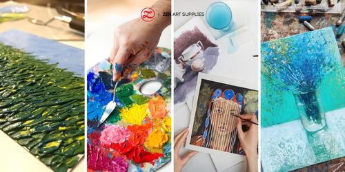
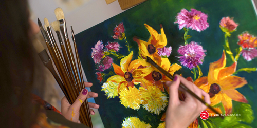
This article follows the Rainbow Colours of the Impressionists, covering the various wonderful oil colors found on the palettes of the Impressionists. Have a look-see and find out what those colors are and how they were used by the masters, it just might inspire you when creating your fabulous colors using oil.
TABLE OF CONTENTS: Looking for something in particular? Jump ahead using the links below:
The Color Wheel
The Four Characteristics of Color
Creating a Color Wheel
Color Harmony : Practical Tips On Using Color For Impact
Oil Paint Mixing Guide - History of the Color Wheel
Color and its relation to light is very similar to that of music to sound. Where color has its hues, tints, and shades, music has its many notes that create the different chords. And so it was in Sir Isaac Newton's estimation, in his color wheel, he had a musical note that lined up with each hue. By conducting several experiments in order to better understand the relationship between colors, he succeeded when he made a hole in the shutter of a dark room and waited until a ray of sunlight shone through, he then stuck a prism into the hole, what he saw was that when the white light that reflected off the prisms, it shattered into a spectrum of colors on the white wall - into the rainbow that we know now. In Newton's own words, "A colored image of the sun." His was one of the earliest color wheel illustrations that is quite similar to what we are most familiar with these days.

Since the mystery of color has long been in the minds of scientists, philosophers, artists, poets, people from all walks of life really - many others would soon follow with their own theories on oil painting color mixing, color mixing, and their own color wheels. Johann Wolfgang von Goethe for example did not agree with Newton's theory that darkness was the absence of light, for him darkness was an essential element in color production, though his findings on his investigation into color was similar to that of Newton's. Perhaps because of his background in literature and the arts, Goethe went into great detail about the psychological effects of color and how it may affect our emotions and behavioral traits.

For the purposes of our oil color mixing, Swiss painter and teacher Johannes Itten's color theory and color wheel is a great reference. This should help you when learning how to mix oil paint. In his wheel, 12 colors are present and have been placed in their respective areas to simplify the instruction of the primary, secondary, and tertiary colors. And he also discussed what he considers to be the four characteristics of color: its hue, intensity, value, and temperature. Just like Goethe, he studied how the different colors affect the viewer, and how each one's perception of color may differ.

How to Mix Oil Paints Color
Primary Colors
Primary Colors cannot be created by mixing other colors. The three primary colors are, red, yellow, and blue and are the source of the secondary and tertiary colors. They are equally distanced from each other on the color wheel, separated by three color spaces between them.

Secondary Colors
Secondary Colors are the colors created by mixing two primary colors together. The three secondary colors are green, orange, and violet. They are similarly equidistant on the color wheel.

Tertiary Colors
Tertiary Colors are made by mixing a primary and a secondary color together. The six tertiary colors are: yellow-green, yellow-orange, red-orange, red-violet, blue-violet, and blue green.


The Four Characteristics of Color
Hue is the spectral color or a source color, it is one of the 12 base colors that you can see in the color wheel above.
Value is the lightness or darkness of a color that can be obtained by adding pure black, pure white, or gray to it. A color is made darker by adding black, and is referred to as a "shade." It is made lighter by adding white, referred to as a "tint." And gray can be used to darken or lighten it, and is referred to as "tone."

Intensity is the brightness or dullness of a color, also referred to as saturation and chroma. The purer your hue is, the more intense it will be. The intensity can be reduced by adding other colors to the pure color.


Temperature is the warmth or coolness of a color. It's important to know that green, blue, and violet have chromatic properties that make them appear cool. They can be effective in creating a quiet and calm mood that recedes into the background. While warm colors like red, orange and yellow tend to advance to the foreground. This is because warm colors have longer wavelengths than cool colors, so your eyes see them quicker than the cooler ones. If you choose a subject that is predominantly cool, then it's good to use warm colors to serve as a contrast and a way to balance the composition, thus creating a visual effect that will grab the viewer's attention instead of confusion as to where and what to focus on.

The use of colors is one of the fundamental elements of art-making. Just like with any skill you wish to hone, a thorough understanding of how you can use it effectively and to your advantage is a must. Too often, many of us dismiss the thought of using color wheels for color mixing and miss out on the many great advantages it can give us. Maybe you might find them too theoretical and boring, but once you give it a chance, you'll see that they are very useful tools to use when planning out your painting's palette. You'll be surprised at how much easier the process becomes with the aid of the color wheel!
Of course, it seems easier to just buy the exact color selections that you want to use, rather than learning how to mix different colors yourself. However, knowing how to create your own hues is an important skill that every artist should strive to learn. Many of the celebrated masters worked with limited color palettes and yet were able to create a seemingly infinite number of colors from those. Another danger of using premixed ones is that unless you check each tube for the specific pigments used, you might unintentionally end up with mixtures that would clash with the other colors in your painting or they'd just turn out muddy. Great freedom awaits you when you can skillfully mix all the colors that your painting needs instead of merely relying on premixed colors.
Now, it's time for you to create your very own color wheel by learning how to mix oil paints yourself. There's no better way to start learning the wonders of color mixing! Remember, there are many versions and variations of each primary color. Some are darker, while others are lighter. Feel free to choose the version you like best, just keep in mind that your basic mixes will vary depending on the foundation colors that you choose.
Oil Paint Mixing - Color Wheel
This is an excellent way to understand the 12 basic colors and have a better grasp of the process on how they are created. Make your own color wheel by following the steps below:
Step 1: Draw a large circle on a piece of illustration board or foam core. Try to make it as perfect as possible so you won't have a hard time dividing it later on.

Step 2: Divide the circle into 12 equal segments. The more equal you make them, the better your color wheel will look after.

Step 3: First, paint the three primary colors inside the pies that are positioned at equal intervals from each - one-third placements around the wheel. There should be three blank pie shapes between each color. These are Cadmium Red, Cadmium Yellow, and Ultramarine Blue.

Step 4: Now, mix the three secondary colors - green, orange, and violet. Once they're ready, use those colors to paint the pies that are halfway between their respective primaries. You will now see a blank pie on each side of every color.

Step 5: Fill in the remaining pies with the tertiary colors that are the mixtures of the primary and secondary on either side of it. Those are blue-violet, blue-green, yellow-green, yellow-orange, red-orange, and red-violet.

Step 6: Now, you have your very own color wheel! Enjoy using it to create your color palettes!
Mixing Oil Colors
Before embarking on your new painting journey, you should first decide on what color palette to use. This will save you a lot of time and keep you from wasting your oil paint needlessly. If you are just starting out, then try using just two to four colors, they are enough to work with and to explore color mixing. Gradually increase the number of colors as you go along and as needed, you will slowly but surely master the art of color selection and mixing before you know it.
Complementary
These are two colors that are on opposite sides of each other on the color wheel. Pick a color and see which one sits directly across from it, those two are complementary colors. Color combinations using this technique will be quite intense, the striking contrast can be dynamic, bold, and even bring an element of excitement to your composition. These colors create great chromatic tension when placed next to each other.


Harmonious or Analogous
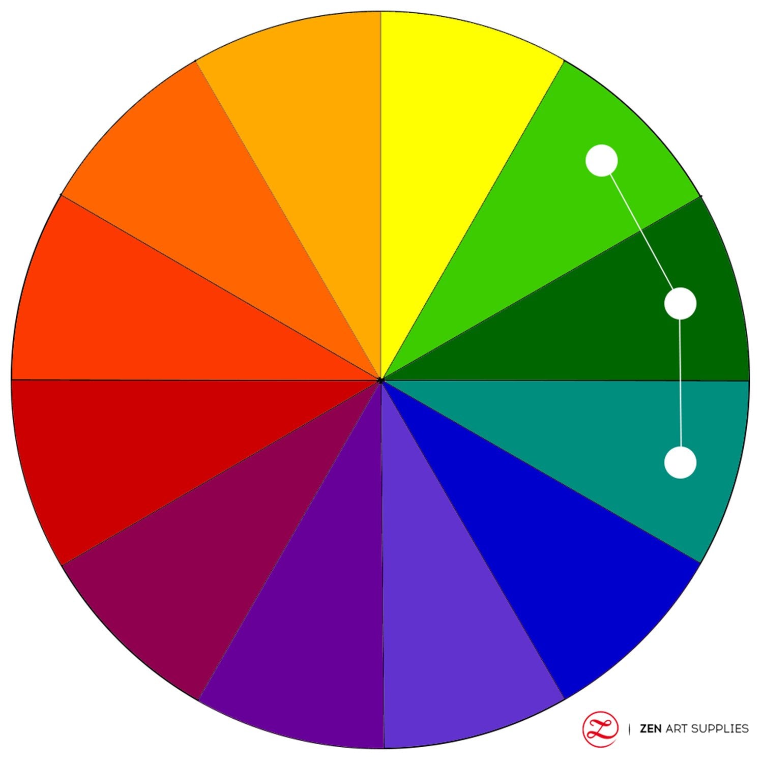
They are hues which sit next to each other on the color wheel. These colors produce a calming effect, easily blend in harmony when used together in one composition, and are often found in nature. When using this technique, one color serves as the more dominant of the three, while the other two support and accentuate it. So, it is crucial to create contrast so your painting doesn't come out as too flat, one way to do this is by exploring the varying values and intensities you can use.
A fine example of this are the yellow, orange, and browns hues that are often found during the autumn season. The yellow-green harmonies associated with the zesty landscapes of spring make for a great analogous color scheme as well. The next time you're out or if you're lucky to have such views from the comforts of home, take a look around or outside and see the countless harmonious colors that abound in nature that are just ripe for your color mixing picking.

Triadic
They are three (tri) colors that are equally distant from each other that you will find on each tip when you draw a triangle over the color wheel. There will be three color spaces between each of the triadic color combinations that separates them. It can be challenging to use this color harmony as the colors are quite strong and can be jarring if you're not careful, just make sure to choose one as a dominant color and use the other two as supporting ones.


Split Complementary
This is a color harmony that creates a color contrast but less intense or visually jolting. It is similar to the theory behind complementary colors, but in this case you have a base color and instead of using the color that is directly opposite the base color, you use the two colors found on either side of it - splitting it. So if your base color is yellow, the other two colors are red-violet and blue-violet (the two colors on either side of violet).


Tetradic
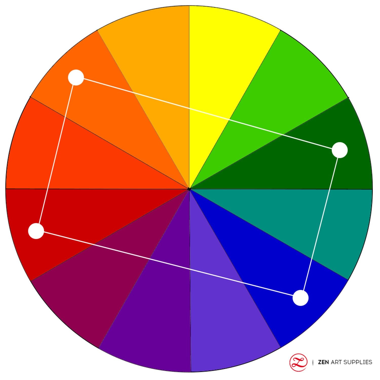
They are colors that are rectangularly spaced apart on the color wheel, and are four (tetra) colors in total that are made up of two sets of complementary colors. This can be a challenging color scheme to manage as it can get sloppy easily, but as long as you remember to use one color as the dominant one when mixing oil paints and experiment around with the balance of warm and cool colors, then this combination gives you more room to work with.

Square
This color scheme also uses four colors, but unlike Tetradic, they are evenly spaced from each other with two color spaces between each other. Similarly, it's best if you choose one as your dominant color, and carefully balance it together with the rest by paying close attention to the relationship between the warm and cool colors.

Achromatic
When defined, it literally means "without color." You solely use black, white, and shades of gray. They are considered to be lacking in hue and therefore neutral. For example, charcoal and graphite drawings are viewed as achromatic.


Monochromatic
A monochromatic color harmony uses one hue only and relies on the different tints, tones, and shades of that hue. This is a great way to practice creating effective designs through the exploration of the tonal values of each color.


Having gone through the different color schemes you can use, it's best to make studies and experiment before you decide on which one is best for your painting. You must keep in mind the harmony of your composition when applying your own oil painting color mixing recipes. Many inexperienced artists will work on a small area of a painting, and move to the next area once it is finished. This jumping from one area to the next without visualizing everything as a whole creates discordance and confusion in the painting, as we have the tendency to forget the colors and style we applied in a specific area when suddenly switching to another, then another, and before you know it, things have been lost along the way.
My Tip: It is better to work on the whole painting at once. Move your eyes around the subject and the different elements, evaluate the relationships of the various colors and tones, and continue to make the necessary adjustments or changes as you go. This way, the painting will develop and evolve harmoniously at every and any stage of the process.

Have fun creating your own color mixtures! Remember: Experimentation is key. Don't be afraid to add pigments and discover new oil colors on your own. Record your formulas, and keep them in a handy color journal you can refer to for future reference.
Along your creative journey, there will be people who will try to persuade you to use certain color harmonies over the others. That's okay, but you should listen to your soul and do what gives you pleasure and satisfaction. The color harmonious listed here are there to give you guidance and help you master your color mixing, but they are not set in stone. Start by learning them to help build your technique and confidence, before long you'll be creating your very own color combinations.
We'd love to hear back from you!
Which colors were a challenge for you to mix? What color harmony/harmonies are you most comfortable using? What color harmony/harmonies are you planning to explore for your future paintings? What future content would you like to see from us? Let us know what you think, we'd love to hear back from you. Feel free to leave a comment, and we'll be happy to answer any queries you have.
To help you in your creation of fabulous colors, watch out for our next piece - Oil Paint Mixing Guide. Until then, have a great time mixing and painting!
- MEET THE AUTHOR -
 Ardak Kassenova is a London based contemporary artist, co-founder and creative director of ZenART Supplies. Her visual style-contemporary impressionism-share similar aesthetic qualities with those by the French Impressionists. After 20 years of a successful corporate career, becoming a mother to two wonderful girls, and with the continuous development of her practice by taking private lessons from the best artists she could find; Ardak decided it's time to align her life with her true passion, Art. Driven by this passion and her corporate leadership background, she co-founded ZenART.
"My heart and soul were always with Art, and since my childhood as long as I remember myself, I was dreaming to be an artist. I was painting after work, when I had time, and teaching myself through the books, videos, visiting art galleries and museums. I've been very curious about different techniques and styles, and therefore accumulated knowledge and experience on a variety of mediums."
Read more about Ardak Kassenova in this feature. Say hello to @ardak_zenart on Instagram!


