What is Composition in Art? Why is Composition important? What is the most common purpose for Composition in Art? | Practical Tips and Techniques
TABLE OF CONTENTS: Looking for something in particular? Jump ahead using the links below:
Jump to Golden Rules of Composition | Pick a good subject | Plan your composition | Create a strong focal point | Use of compositional maps | Colour choice | Positive and negative spaces | Scale and perspective
What is Composition in art?
Composition in art is the arrangement of the various elements within an artwork. In more detail, it is how the elements of art and design - line, shape, form, colour, texture, value, and space - are laid out in accordance to the principles of art and design - scale, proportion, unity, variety, rhythm, mass, shape, space, balance, contrast, emphasis, volume, perspective, and depth. Creating a harmonious relationship between the elements and the principles. Here in this article, I tried to explain the basic principles and rules of composition in simple terms, with illustrative examples based on the great masters' works, and a few of my own as well.

What is the most common purpose for Composition in art?
Composition is an often overlooked step in art making. Perhaps all the rules put together seem too daunting, but if you tackle them one at a time, you'll realize that they're actually quite straightforward. Understanding the how and why of each rule gives you the freedom to creatively use them in endless ways or even to break away from them. When done right, it brings you one step closer to creating a compelling work of art.
How you arrange and position the elements within an artwork will affect how a viewer experiences and interacts with it. If the elements to be used are haphazardly planned, the final work can end up being too chaotic. The goal is for all of them to exist together in harmony. For each work, one or two elements may dominate and become the focal point(s), and the other elements take supporting roles. A successful composition in art ensures that there aren't too many elements competing for attention. This way, the viewer's eye will know where to focus and can better appreciate the work in its entirety.
The Golden Rules of Composition
'And after drawing comes composition. A well-composed painting is half done.'-Pierre Bonnard
Leonardo Da Vinci's ink drawing called "The Vitruvian Man" is an excellent example of the ultimate golden rule, the "Golden Ratio" in art composition. Mathematically, it is a ratio of 1 to 1.618, also known as the "Golden Number". It illustrates the ideal proportions of the human body, blending mathematics and art perfectly. During the Renaissance, artists called it the "Divine Proportion", they applied the mathematical theory to their compositions in order to create an aesthetically pleasing and balanced work of art. The most common application of it is the usage of a Golden Rectangle as illustrated in the image below.

That is just a very quick passing on the Golden Ratio, for it certainly deserves its own chapter for an in-depth understanding of its history, the mathematics, and how it can be put into practice. Today, there are other simpler and easier ways to achieve a good composition in art. Let's dive into each one below.
Pick a Good Subject
Picking a good subject matter that is aesthetically pleasing might sound too obvious, but creating a good composition starts with having a great subject and brings you one step closer to your goal. Why not start by finding inspiration from subjects around your home for a still life or perhaps you will feel more inspired by the outdoors? You can start with a theme in mind, such as various landscapes, or simply something that is striking to the eye like a vase of vibrant flowers, to help develop your use of colour.
Don't limit yourself, try to explore them all, and you might just stumble on the one that inspires you the most. It's important that you are genuinely interested in your subject, this passion will sustain you and will show in your finished work. Keep in mind that your aim early on is to develop your skills, and to quote Vincent Van Gogh, "As practice makes perfect, I cannot but make progress; each drawing one makes, each study one paints, is a step forward." As you can see, Van Gogh's interest with the sunflowers was so great that he created so many paintings of them as the subject matter.

Clockwise from top left: 1st version, 2nd version, 3rd version, and 4th version. Each painting has sunflowers as the subject, and yet each one differs from the other versions, showing how much you can explore the variations of a single subject that genuinely interests you.
Plan Your Composition
To create a good composition in art, imagine you are designing a visual map for the viewer, to draw their attention towards a strong focal point. If the elements are just randomly placed without thought as to their function, the viewer will be left in confusion and may lose interest because the work feels incomplete. This is why how you arrange them in your painting should be done with great consideration and careful study. The last thing you want is your work looking like a collection of scattered items without harmony and connection to each other.
This is where the habit of daily sketching will greatly benefit you, having a sketch journal at hand gives you time to work on your ideas, write down your notes, and create several studies of your potential artwork before moving on to the next stage.

Create a Strong Focal Point
The focal point of a painting is the section which naturally draws in the eye of the viewer. Focal points have no restrictions and can be of any size, shape, or colour you choose. Creating strong focal points is an essential skill to master as it will influence the overall composition of your artwork and how it will be viewed. To ensure that, there are several techniques that artists can use - contrast, isolation, placement, convergence, and the unusual. Before you begin any painting, take your time and come up with a focal point. Ask yourself questions such as:
- What is the main attraction of my painting?
- How do I want it to stand out?
- What technique can I use to make sure it stands out?
These leading questions will ensure that your art composition has a strong focal point and will capture the viewer's attention.

Use of Compositional Maps
Brilliant art masters such as Leonardo da Vinci, Giotto, and Titian perfected this compositional drawing technique. Compositional maps emphasize the main subjects of the painting, allowing them to stand out from the rest by capturing the viewers' eye, seamlessly leading it around the artwork towards the focal point.
The Triangle
The triangle in art is a time-tested favourite among artists when aspiring to create a perfectly balanced composition. It's a very stable and strong shape and translates well when used as a compositional guide.
The lines guide the eye of the viewer to move from one point of the triangle to the next in a continuous flow, eliminating distractions and allowing the eye to focus on the main subjects with great ease. The invisible triangle visually holds all of the painting's elements and their relationship to each other together.
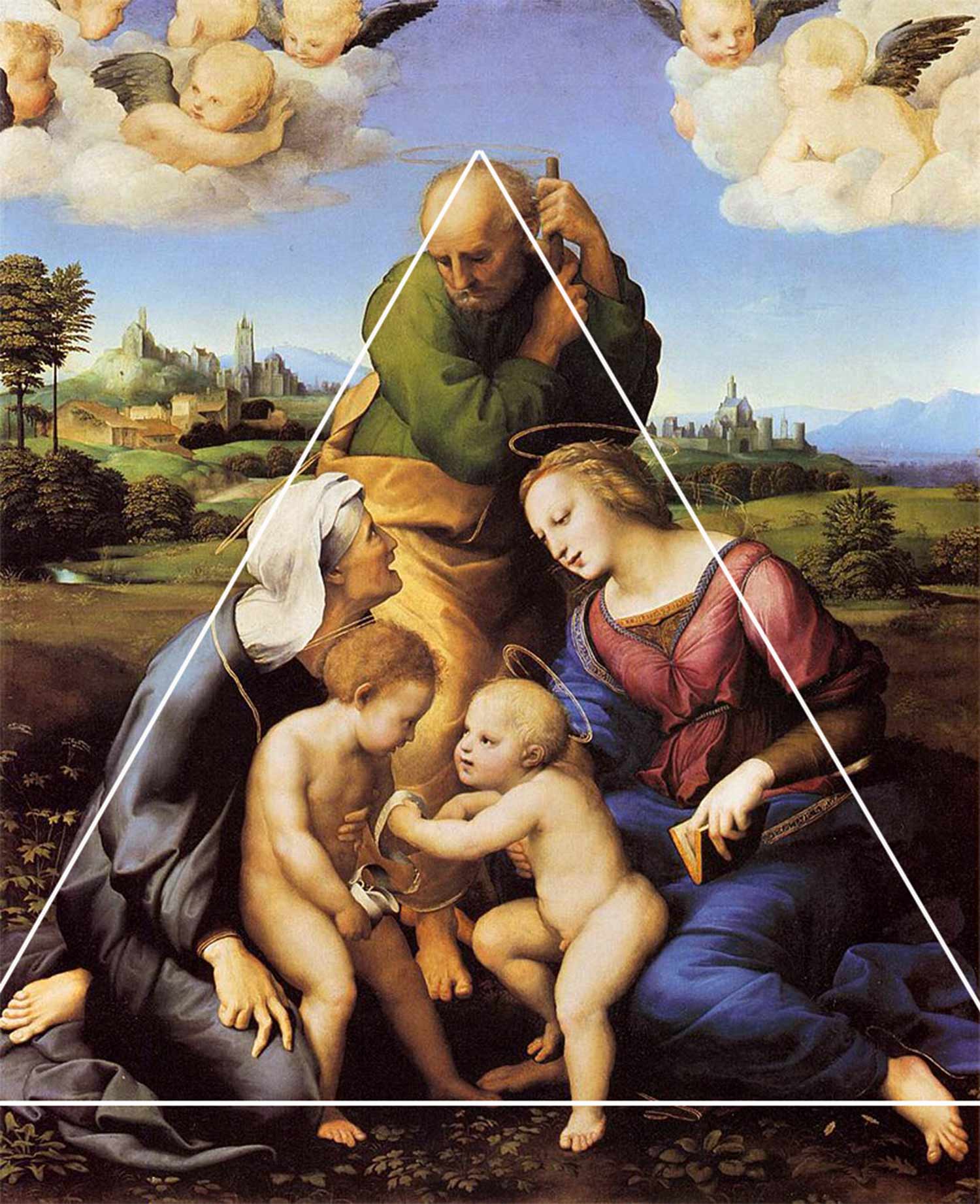
When you use more triangles, the chances of achieving a more dynamic composition in your work increases as well. Below is an example of an artwork containing more than one triangle, creating a very interesting visual conversation.
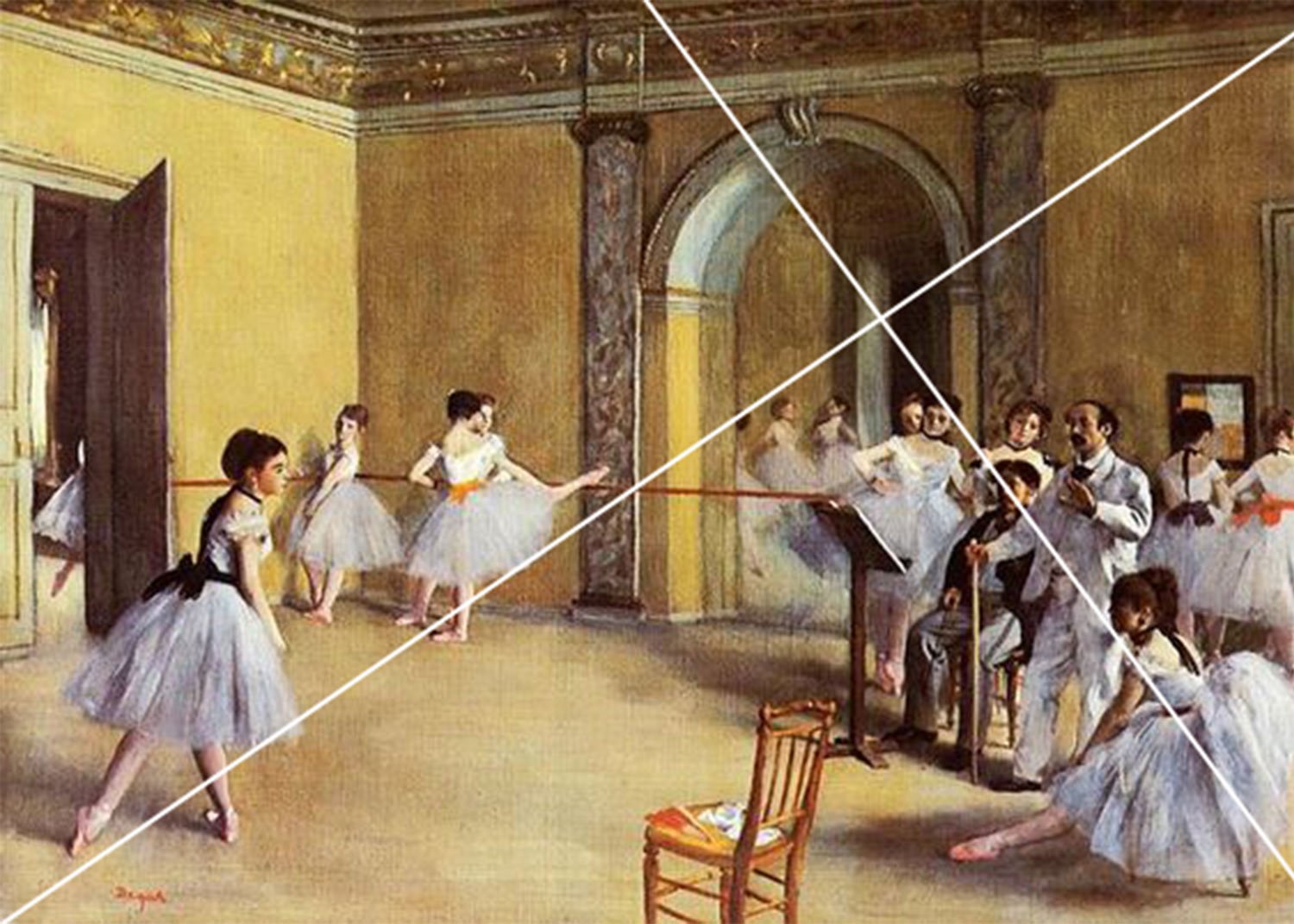
The Rule of Thirds
Three is clearly a golden number when laying out the different elements in art and is by nature, also a balanced number. This mathematical theory can be used in creating compositions in art as well, it helps the placement of the subjects in your painting to remain balanced and not all crowded at the centre.

This is how it works: Imagine your picture plane, then divide it by thirds of both horizontal and vertical lines. Now, you have grid-like divisions across the whole surface. The four points where the horizontal and vertical lines intersect each other will be the best placements for your focal points.
It's time to decide which of the four to use for your main focal point, then use the remaining three points for the supporting elements. Placing your important subjects on or very near these points ensures an even distribution and creates an aesthetically appealing composition. This gives the eye of the viewers a balanced space to move around in and better appreciate each key element of the painting.

Make use of the magic circle
Using the magic circle in your composition in art gives it a sense of balance accompanied by the flowing motion of the circular shape, creating a natural attraction between the viewers' eye and the artwork. To use this drawing technique, you can have an actual round shaped object with or as your subject or place your key elements in a circular formation, this ensures that your viewers' attention is focused exactly where you want it to be.


Balance of your Colour Choices
Now that you're familiar with the different ways you can achieve eye-catching compositional mapping, let's get acquainted with the similarly important theory of colour harmony. In art composition, colour harmony deals with the various characteristics that aesthetically pleasing colour combinations have. These combinations create contrasts and complements that are considered to be harmonious. They can be of complementary colours, split-complementary colours, colour triads, or analogous colours.
When choosing your colours, make sure that they are in balance with each other. Study the difference between warm and cool colours and take advantage of the Colour Mixing Guide to help you plan out your colour palette.

Balance Positive and Negative Space
Positive space is the main focus of your artwork, while the negative space is the background or the area surrounding your main object. Negative space is not blank space, but rather serves as a support to accentuate the object of focus. Balancing the negative and positive space is a delicate process, you can easily go overboard either way if you're not careful. To be on the safe side, try to keep approximately equal amounts of negative and positive space in your art composition. However, if you wish to create a busy, crowded painting, using a lot of negative space works well by giving emphasis to the positive space. When used well, how you balance your positive and negative space will help tell your stories in your compositions in art alone.


Master Scale and Perspective
Scale
The term scale refers to the size of an object in relation to the other objects in your artwork. We often relate scale to the size of the human body, if the object is smaller or bigger in relation to us. It also refers to the whole structure of your work's composition in art.
Artists from various periods have explored the use of scale to create visual impacts. When used with ideal proportions, it can give your painting a sense of realism. But when altered to a larger or smaller than life size, allows the artist the opportunity to make a statement or bring an element of whim or fantasy to the work.


Perspective
Perspective is a technique used to create three-dimensional imagery on two-dimensional surfaces to give them the illusion of depth. When it comes to compositions, there are two kinds of perspective - linear perspective and atmospheric (aerial) perspective.
Linear Perspective
Linear perspective is achieved by using lines and vanishing points. As the object draws nearer to the vanishing point, the smaller and less detailed it will be. A single artwork can contain a one-point perspective, two-point perspective, or a multiple-point perspective.
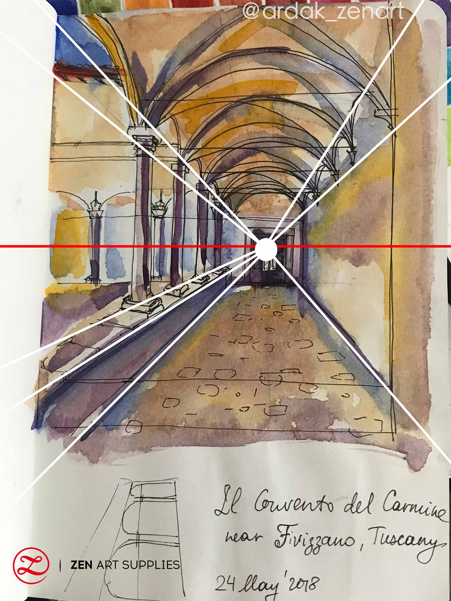

Imagine yourself walking along a straight road with telephone poles lining the sidewalk. The poles nearest you are tall and the details are clear; but as you look ahead, the poles gradually become smaller and the details become hazier and hazier the farther they are from you. Eventually, the last ones visible to your eye look so small that it seems like you could pick them up with your thumb and forefinger. Having a thorough understanding of perspective is quite important when creating art compositions of landscapes and cityscapes.
Atmospheric perspective
Another way to show depth and distance in your painting is through the use of atmospheric perspective. As the name suggests, this is a technique that shows the effect of the atmosphere in your composition. For example - objects in the foreground like the grass, nearby trees, and flowers are in sharper focus and details and have deeper or brighter colours and values. As the landscape recedes, the atmosphere will cause objects to appear paler, blurry, and have a bluer tone. If the sky is overcast with little to no sun, the atmosphere will cause distant objects to look even paler and less sharp, having an even more greyish than blue tone.
Normally, the farther the background goes, the paler the bluish tone will be. But remember, there are always exceptions especially in nature. Autumn colors, a cloud casting a shadow on a faraway hill, areas that are suddenly more densely covered with trees - all these can cause some areas in the background to be darker or of a different colour. Just be sure to observe your surroundings with thoughtfulness and try to capture the beautiful colour changes you see.

Contrasting colours helps give an illusion of depth and space in your painting. With the use of warm, earthy colours for the foreground and cool colours for the horizon, thereby creating the optical perception of even greater depth.

(Below) Mid-progress of my painting on canvas using contrasting colours. You can see how helpful it is to first sketch out your ideas, simplify and even make compositional decisions (like removing some trees) before committing to it on canvas.
Practicing the use of scaling and perspective can be easy! Start out by studying photos showing fundamentally correct scales and perspectives, copying their layout, and paying close attention to how the details differ or change. And nothing beats painting en plein air for a better understanding of how atmospheric perspective works. Once you have a better grasp of how these two work together, you can slowly explore and experiment on the different ways you can use them for your own compositions in art.
I hope that this has given you all the tools you need to explore and experiment in creating your own compositions. Take your time and tackle each rule or technique one at a time. Remember to keep your sketch journal handy and practice sketching on it as often as you can, bring it along as you never know when or where inspiration might strike!
And of course, we'd like to hear about your experience. Which rules of composition are new for you? Which one/s do you normally/intuitively use? What rule of composition in art do you find most challenging? Feel free to leave a comment, and we'll be happy to answer any queries you have.
So, now that you have gone through the Golden Rules of Composition, it's time to put them into practice! The next chapter we have in store for you will help you jumpstart your composition exercises - Tricks of the Composition Trade, easy and useful tips you can use to help you achieve great art compositions.
- MEET THE AUTHOR-

Ardak Kassenova is a London based contemporary artist, co-founder and creative director of ZenART Supplies. Her visual style-contemporary impressionism-share similar aesthetic qualities with those by the French Impressionists. After 20 years of a successful corporate career, becoming a mother to two wonderful girls, and with the continuous development of her practice by taking private lessons from the best artists she could find; Ardak decided it's time to align her life with her true passion, Art. Driven by this passion and her corporate leadership background, she co-founded ZenART.
"My heart and soul were always with Art, and since my childhood as long as I remember myself, I was dreaming to be an artist. I was painting after work, when I had time, and teaching myself through the books, videos, visiting art galleries and museums. I've been very curious about different techniques and styles, and therefore accumulated knowledge and experience on a variety of mediums."
Read more about Ardak Kassenova in this feature. Say hello to @ardak_zenart on Instagram!


