Easy To Draw Cornucopia | Color Palette Used | Step by Step Painting Explained and Illustrated Using Watercolor
In this how to draw a cornucopia tutorial, we'll go through the step by step process from drawing a simplified version based on a more elaborate reference photo. Followed by planning out the color palette with the colors to be used for all the various elements. This is my personal take based on the photo, so feel free to choose your own color preferences. Then from which colors to start off with for the first layers. And then working around the whole composition one fruit or vegetable at a time, slowly adding layers as I circulate.

Before diving into the cornucopia drawing, let's first venture a little while into the symbolic meaning behind this bountiful presentation.
TABLE OF CONTENTS: Looking for something in particular? Jump ahead using the links below:
What is a Cornucopia?
Materials
How To Draw A Cornucopia Step by Step
Easy To Draw Cornucopia
Painting The Cornucopia Drawing Using Watercolor
What is a cornucopia?

You will often see representations of them with one main and important element in common - a curved, hollow vessel such as a basket or a goat's horn overflowing with a variety of fruits and vegetables in all their vibrant autumnal colors. From the Latin cornu copiae, cornucopia literally translates to "horn of plenty." In Greek mythology, it is believed to represent the horn of a goat that was used to feed the god Zeus when he was but a baby. And later on was then filled with fruits and flowers to be offered to Zeus as a gift. Whether in art or literature, the cornucopia has always been a symbol of abundance.
Before I start going through the process of the cornucopia basket drawing and painting, I'll list down the materials I used below.
Materials:

- Watercolor paper - I used a 300 gsm paper so I didn't have to pre-stretch the day before. And was confident it wouldn't buckle so much because I wasn't planning on doing a lot of very wet washes.
- HB graphite pencil - you don't have to worry about drawing lines that are too dark, this is the pencil I use most often when sketching for a watercolor work.
- Kneaded eraser - for erasing while sketching and for softening the pencil marks even further before painting over them.
- Reference photo - remember, you're not a camera, the reference photo is there to mainly guide you and not weigh you down.
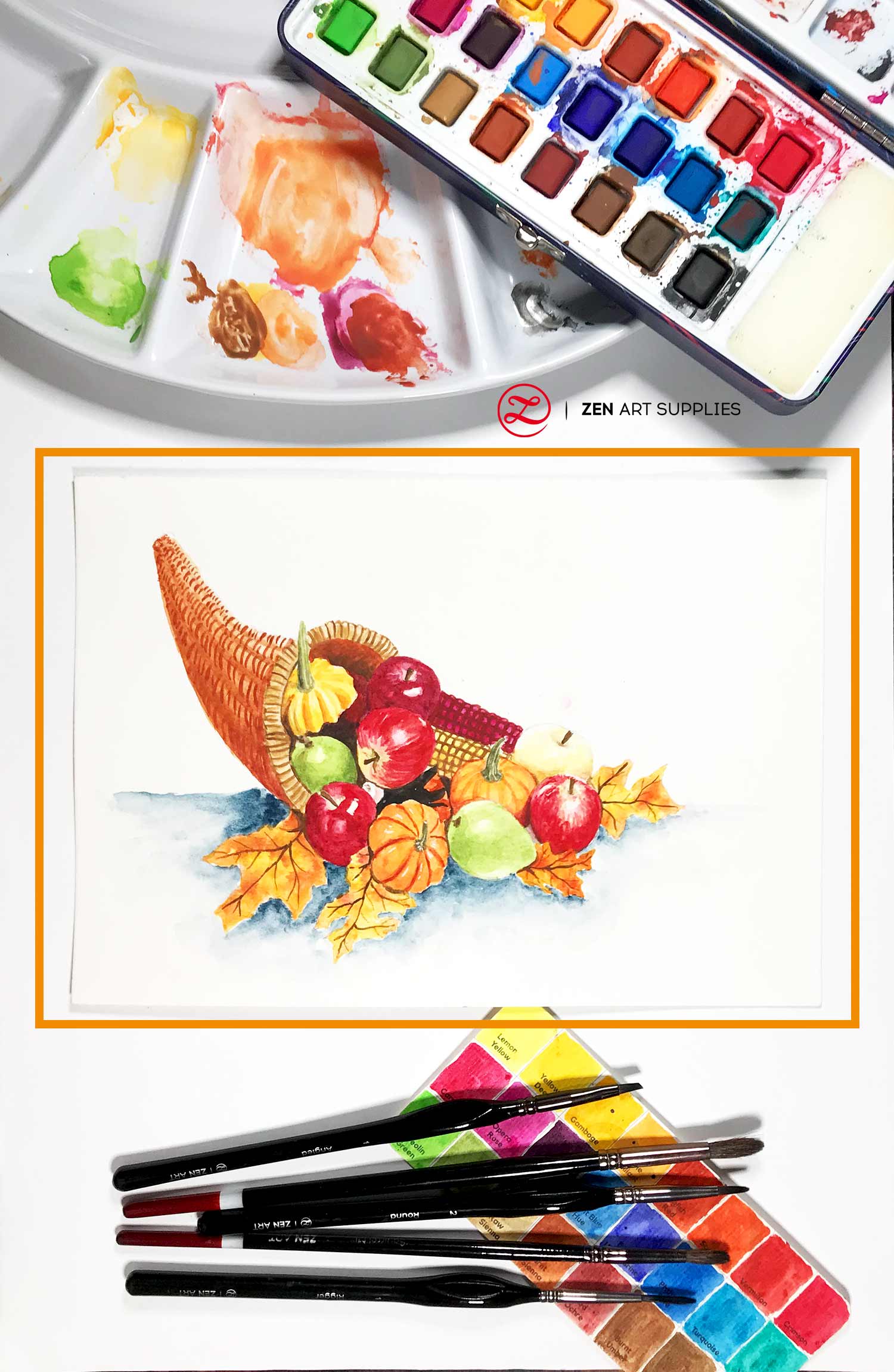
- Watercolor paints - I used the Allegro Palette from ZenART Supplies. It's just the perfect watercolor palette as it carries a multitude of warm colors - definitely a lot of reds and yellows that I totally used for this painting. I also used one color - Indigo - from the Sereno Palette.
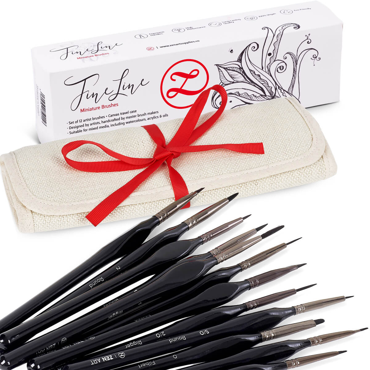
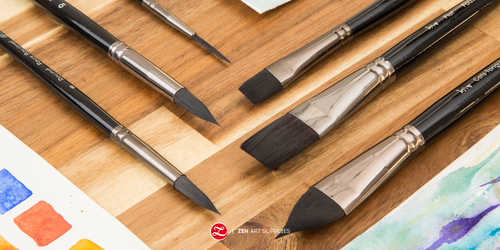
- Watercolor brushes - I used brushes from the Turner Collection and the Fine Line collection, both are also from ZenART Supplies.
- Mixing plate - I used one of my ceramic serving platters that I have always stashed and never really used for food. It feels good to repurpose something I already have lying around instead of buying something new.
- Paper towel or your preferred absorbent material.
- A Jar or two of clean water.
How To Draw A Cornucopia Step by Step
First things first, I chose the photo below as I wanted the full curve of the horn-shaped basket to be clearly visible. You will observe that I will not be including all the fruits and vegetables you will see on the image - especially the grapes. That's another challenge we'll leave for another time.
Here's the original full composition, I simplified it so it won't be too overwhelming especially if it's going to be your first time tackling the cornucopia.

And here's the modified and somewhat easier version I made. It still looks quite bountiful in my opinion, so no harm done there. But if you'd like to paint the original unedited, totally go for it - here's the link to the image!

Easy To Draw Cornucopia
Step 1 - Using a grid to make sure the composition is balanced
It's very important to plot out the right placement of your object/subject on your paper. We've all gone through the experience of spending so much time and effort perfecting the sketch and all the details and then realizing too late that the placement and spacing looks off. For subjects such as the cornucopia it's best to use a simple grid guide to help with that. Measure your reference photo and use the exact measurements for the paper you will be sketching on. You can enlarge it or make it smaller, just make sure to use the same ratio. Then add the grids as they will greatly help you in making sure all is good before going into the more detailed sketching.
Want to learn more about how to create balanced or dynamic compositions? Have a look at our Golden Rules Of Composition In Art and Tricks Of The Composition Trade articles. They're chock full of illustrations, examples, and explanations that'll open your mind to all the wonderful possibilities!

Just a quick and rough sketch to make sure you're drawing it in the right place and size.

Step 2 - Working on the details one object at a time
I started with the basket as all the other elements are tied to it in some form or other. Beginning with the rim, followed by the body, and then adding the lines for the texture/weaving.

And now onto the fruits and vegetables starting with the green mango (or at least it looks like one to me) resting on the basket. Then moving to the pumpkin beside it, followed by the apple next to it, and then the apple in front of it. I've colored each fruit/vegetable for each step so you can easily see which ones go next. When drawing your compositions out, it's always a good idea to keep checking each element in relation to the other elements. That way you'll realize much sooner if something feels off.

We're moving slightly out and away from the basket now starting with the red apple in front of the green mango. Then the pumpkin resting against it, adding the other elements under them, and then finally drawing the first leaf.

And now down to the last few fruits and vegetables. Using the pumpkin as the guiding point, I started with the green mango. Followed by the apple beside it, then the pumpkin behind those two, and then finally the pear behind all three.

Now we can finally draw in the yellow and red corns. It's much easier drawing the elements upfront and then using them as a guide to then slowly add the ones at the back. And finally the last three leaves spread out across the whole composition.

And here's the final sketch!

You can download this cornucopia drawing for FREE here and print it out to use it as a guide or to trace over it.

Painting The Cornucopia Drawing Using Watercolor
Now that we have the sketch done, make sure the line drawing is not too dark before you start painting. Unless of course it doesn't really bother you if your drawing is visible on your finished work. It's near impossible to lighten or erase once you've painted over them. I just dab or roll my kneaded eraser over the parts that I want to lighten.

Since there are a lot of elements and color mixtures to be done, I decided to plan out the colors I'll be using and swatch them out on a separate piece of paper. That way I can still make changes if I'm not happy with the colors I chose.
Once I'm satisfied with my color palette, I applied my first layer. With watercolor, the lighter/lightest colors go first and the darkest last. In this cornucopia drawing and painting tutorial, the lightest is yellow - the first layer for most of the fruits/vegetables in this composition.
Then followed by Raw Sienna for the basket. While the paint is still wet on the one leaf I colored with Yellow Deep, I added dabs of Scarlet and English red to it. Since I used the wet-on-wet technique, I tried my best not to interfere too much so the water and pigment will spread naturally and wonderfully. I have the tendency to be too controlling with my watercolor at times.
For the pumpkin I used Scarlet to create the lines and shadows of its ridges, and Olive Green for the stem. I then used Crimson on the apple beside and under the pumpkin. To preserve the whiteness of the highlight, I painted around it and left that part of the paper white.

It's time for another wet-on-wet for the more textured apple. I wet the surface again using a very pale wash of Lemon Yellow, then used the tip of my Round brush to add streaks of crimson in. Since the highlight is more subdued, I just opted to color-lift the red after. Because the surface was wet, the edges of the red streaks become softened and look more organic.
Then I add Ultramarine Blue and Red Ochre to the apple underneath that's in shadow. I move on to the green mango beside it, adding a layer of Aureolin + Olive Green mix, and then just Olive Green for some darker shading. Next is the apple in front of it, using the same colors and the same techniques as the other similar apple without the streaks.

Finally, I'm slowly working my way to the right on the two other pumpkins. Using Jaune Brilliant to deepen the orangey color. Then for the pear, another layer of Lemon Yellow with dabs of Yellow Deep, and then Raw Sienna for the shadowed area. And next on to the green mango, the same color mixtures as the other mango earlier.

I add more of the same mixtures to the other mango to further deepen its colors. Then for the rounder shaped pumpkin, I used Scarlet to add the lines and texture, and English Red for the shadows. Then for the apple on the rightmost, I did the same techniques as the other streaky/textured apple. And before I overlook them, I add the orange peeking through from under the pumpkins - probably another one, I think anyway.

For the pumpkin at the front and center, Scarlet for some shading to give it a more three-dimension body, and English Red for the shadows lining the dips all around.
All the leaves are painted using Yellow Deep all over in one full wash, then followed with intermittent dabs of Scarlet and English Red. This was the most fun part for me! You can never predict how the colors will spread and mingle!
And finally the corns get some attention, too. Lemon Yellow and Yellow Deep for the yellow corn, and Carmine with Ultramarine Blue (and I spontaneously decided to add a bit of Opera Rose) for the red corn.

Things are truly starting to come together at this stage of our cornucopia drawing and painting, and it's about time to fill in the shadowed areas and deepen the shadows and cast shadows on the fruits and vegetables. This will really help to bring their vibrant colors out and in contrast with the shadows - using Burnt Sienna and Burnt Umber as well as adding the black part of the pumpkin underneath. I also paint in the stems using brown for the apples and mangos, then Olive Green with a thinned down Lamp Black for the pumpkins.
Then back to the corns again, I used Burnt Umber for the yellow one and Red Ochre for the red one to paint the rows of corn kernels in. Using a small round brush from the Fine Line watercolor brushes set, I did a curved grid first, and then softened the square shapes and made their corners rounder. Just like how the corn looks like.
And I finally am going back to the basket itself, starting with the rim and painting the texture in using thin curving lines.

Followed by a layer of Raw Sienna to add some shadowing here and there and give it that extra depth. Then I painted a wash of Burnt Sienna on the basket's body with a deeper shading at the bottom area. While waiting for the basket area to dry, I work around the fruits and vegetables and add shadowing and other details here and there.
Then I go back to the basket's body and paint in thin curved lines loosely mimicking the weaving of the basket. And I add another layer of Burnt Sienna to suggest dips and curves on the basket's body.
And the end is almost near! I used Indigo from ZenART's Sereno Watercolor Palette for the surface under the cornucopia. Just lightly and loosely painted in, adding the necessary cast shadows around the fruits, vegetables, leaves, and basket.
This part got cut from the video: To paint the veins of the leaves, I used the Rigger brush from the Fine Line set with Brown Ochre. The Rigger really makes it so much easier to paint the fine, thin lines.

AND that's it, I now have a finished cornucopia drawing and painting that I like and enjoyed creating. I hope this helps guide you and inspire you to paint your own, too! You can have less fruits/vegetables or more, it's really up to you. As long as you have fun doing it, that's the most important thing!
If you're in the mood for more autumn painting tutorials, check out our How To Paint Leaves - Autumn Leaves article. It goes through the step by step layering and various techniques, and also has a downloadable free sketch that you can get.
Which fruits or vegetables do you think are challenging to draw and paint? Which ones are your favorite? What other autumn themed works are you looking to paint? What future content would you like to see from us? Let me know in the comments below! Join our friendly art community Painting Inspiration Daily on Facebook. You can share your art and ideas, watch LIVE tutorials, and be inspired to paint!
For our next one, let's do some early prepwork for Christmas and paint Watercolor Christmas Cards. Until then, have a wonderful time learning how to draw a cornucopia and paint it as well!
- MEET THE AUTHOR-

Kathleen is the Wordsmith at ZenART, resident artist and art editor. When God sent a shower of talents, Kathleen made sure she got a basketful of them! She's a visual artist with practical knowledge on various fields from painting and sculpture, to costume and set design which comes in very handy when writing about various art techniques and theories. She also shares her passion for the arts through teaching. She runs her own brand of handmade wirework jewelry designs.


