Oil paint palettes are traditionally made of wood and are oval shaped. Place your paints around the edge and use the center to mix colors. This palette is practical if you want to stand at your easel with your colors right in front of you.

I don't have a painter's palette, so I like to use palette paper that comes in a pad. Sometimes, I tape the palette paper to the table where all of the paint tubes are waiting. If you don't have a palette, you can tape palette paper to a piece of foam core.

If I don't have palette paper, the best substitute is butcher paper. This comes in a long roll; butchers use it for wrapping meat. It has a shiny side and a dull side. You want to use the shiny side. Itu2019s inexpensive and works well. Now that you are set up let's talk about oil paint palettes and their relationship with artists' colors.

Oil paint palettes and artists' colors
The second use of the term oil paint palettes refers to the group of colors you choose to use in your work. Since we are talking about paint colors, we need to talk a little bit about color theory. It may sound boring, but actually, I find it fascinating. And, an understanding of color theory will make your color decisions easier.

For instance, here is an unusual color wheel that we can use for this discussion. There are three primary colors that you cannot mix. You have to buy them. Weu2019ll address the issues with these colors a little later. They are:
- Red
- Yellow
- Blue

From those three primaries, you can mix the secondary colors:
- Red + Yellow = Orange
- Yellow + Blue = Green
- Blue + Red = Violet

Additionally, you should understand that the color wheel shows you which colors are complements. If you want to bring a sense of vibrancy or sparkle to your work, you need to use complementary colors. These combinations are the oil colors directly opposite one another on the color wheel.
So, the complement of our primary colors are:
- Red > Green
- Yellow > Violet
- Blue > Orange

Do you see the connection? The complement of each primary color is a secondary color made by mixing the other two primaries. For example, the complement of the primary color red is green, which is made by mixing the other two primaries, yellow and blue.
A little image critique

This abstract painting has several interesting color choices. The orange circle is the focal point and seems to vibrate or glow because it is nearly surrounded by its complement blue.
You can see a little green with strokes of yellow in the lower left. Remember, yellow and blue make green. And then there is the lovely, vibrant red in the upper left.
The magenta swatch of paint divides the painting in half. For a better composition, I would suggest staying away from making such marks. For example, a building, a river, a tree or a vase of flowers set in the middle of the canvas can cut a painting in half vertically.
Artists who cut paintings in half horizontally, usually do so in a landscape by placing the horizon line right across the middle. Horizon lines should be either high (if you want more room for what is on the bottom, a farm and fields for example, or low (if you intend to have a dramatic sky). We will talk about composition in a future post.
But, which red, yellow, and blue?
This is a legitimate question. If I tell you blue is a primary, and you have four different blues in your hand, which one should you use? It does make a difference as some blues fall on the warm red side and some blues fall on the cool side. Fortunately, artists have worked out these issues and come up with some answers.
There are so many variables with colors that, with experimentation and practice, you will figure out just which oil paint palettes work best for the art you want to create. When you do, they will become your personalized oil paint palette.
You can see an example of a strong color palette in the work of Vincent van Gogh.
u201cWithout the color orange and without the color yellow there can be no blue.u201d
- Van Gogh

Vincent van Gogh's personal color palette
This is 'The Church at Auvres', and one of the last paintings van Gogh did before his death in 1890. Notice the square of orange on the right side roof. He let a little of the color snake up diagonally to the left and up to the level above. There's a touch of orange in the building behind the church. You can see this color palette repeated in many of his paintings. Look at his series of paintings called 'Wheat Fields with Crows' and 'Starry Night', and his color palette becomes obvious.
This is the specific color palette that van Gogh used in his paintings. Some of these old colors are not only toxic and contain lead, antimony, and mercury, they are also unstable; they fade away, or the original color changes to something else.
Those colors in his palette are Yellow: Chrome yellow (cadmium yellow); yellow ochre; Orange: chrome orange; Red: geranium lake; vermilion, red lead, carmine (cochineal), Blue: cobalt blue, French ultramarine blue, Prussian blue, Green: emerald green, viridian green, Earth colors: raw sienna, red ochre, lead white (substitute titanium white), zinc white, bone black;
Although I doubt that paint manufacturers still make "red lead" and "lead white," you may have trouble finding some of the older colors. There are 19 colors listed in his palette. If you want to use the colors he did, just choose six or so plus black and white to start with.
Discovering your personal color palette
To simplify life, researchers have assigned a specific paint color name to each primary and secondary color. However, you should try mixing other reds, yellows, and blues to see what else you find. Start with a minimal amount of paint. It will be enough to tell you if you've found a combination you like. Mix with a palette knife. Don't forget to place a sample of your mix with a list of colors you used in your studio journal.

Primaries*
Red = Alizarin Crimson
Yellow = Cadmium Yellow Light (Cadmium is often shortened to Cad)
Blue = Phthalocyanine Blue (Phthalocyanine is shortened to Phthalo or Thalo)
Secondaries
Orange = Cad Scarlet or Cad Red Orange
Green = Veridian Green
Violet = Ultramarine Violet
*I got these colors from the book Color Choices by Stephen Quiller. The book comes with a copy of the Quiller Wheel. This color wheel has 68 colors and shows where they complement and differ from other colors. It is my favorite color wheel. Although Color Choices was first published in 1989, it is still available.
Keep experimenting!
As an artist, the most valuable tool in my artist's toolbox is color. If you look at my art, you will find lots of bright colors mostly in the red, orange, and yellow part of the color wheel. I also like blues, especially Prussian blue and turquoise blue.
A large part of learning how to paint in oils is experimenting with mixing oil colors. As long as you keep a record of your mixes so you can reproduce the ones you like, you will be building your library of colors and your oil paint palettes. Someone asked me recently if it is possible to come up with new colors. I answered, Yes! Every time you mix two or more paints, you have discovered a new color. Have fun on your color journey.
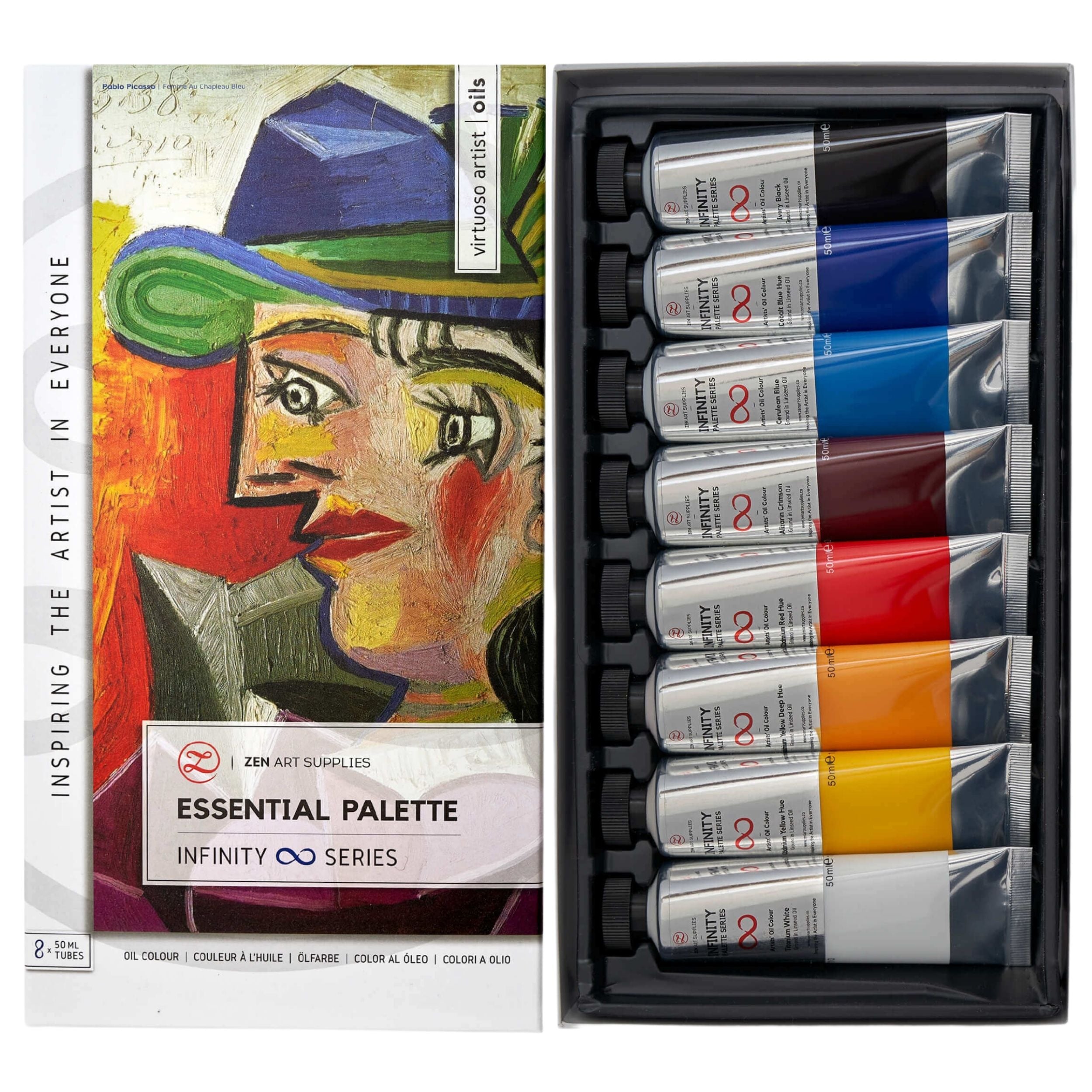
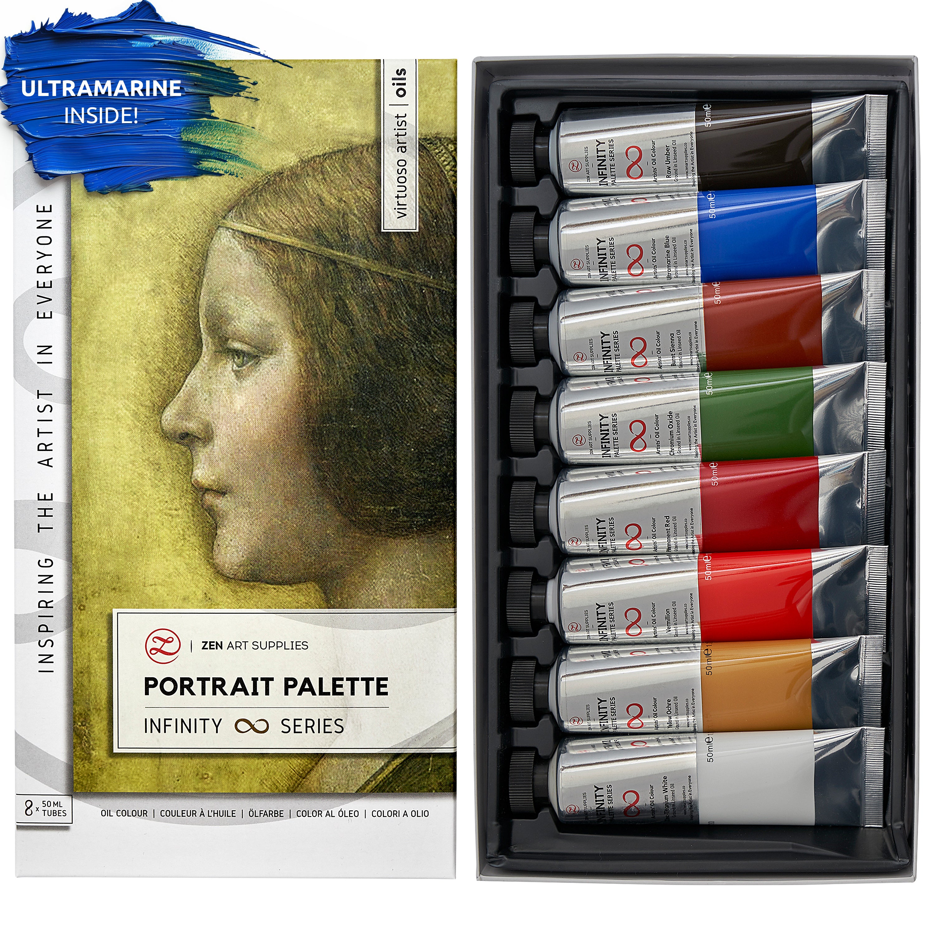
At ZenART Supplies we have an Infinity series of three oil paint palettes: The Essential Palette, Impressionist Palette, and Portrait Palette. Each set has eight colors including black and white. They have been specially chosen to fit with all the colors from that palette and with each other. The paints are smooth, creamy and hold the oil paint brush marks. Learn more about the different oil painting brush strokes and techniques to fully explore the beauty of oil paints.

We'd love to hear back from you!
Do you have your personal color palette that you tend to use most often? Which color combinations or harmonies are you attracted to? Anything youu2019d like to see or learn more about that we havenu2019t covered yet? Let me know in the comments below, and Iu2019ll happily get back to you. Join our friendly art community Painting Inspiration Daily on Facebook. You can share your art and ideas, watch LIVE tutorials, and be inspired to paint!
- MEET THE AUTHOR -

Ardak Kassenova is a London based contemporary artist, co-founder and creative director of ZenART Supplies. Her visual styleu2014contemporary impressionismu2014share similar aesthetic qualities with those by the French Impressionists. After 20 years of a successful corporate career, becoming a mother to two wonderful girls, and with the continuous development of her practice by taking private lessons from the best artists she could find; Ardak decided itu2019s time to align her life with her true passion, Art. Driven by this passion and her corporate leadership background, she co-founded ZenART.
u201cMy heart and soul were always with Art, and since my childhood as long as I remember myself, I was dreaming to be an artist. I was painting after work, when I had time, and teaching myself through the books, videos, visiting art galleries and museums. Iu2019ve been very curious about different techniques and styles, and therefore accumulated knowledge and experience on a variety of mediums.u201d
Read more about Ardak Kassenova in this feature. Say hello to @ardak_zenart on Instagram!


