In our previous article, Tricks of the Composition Trade, different techniques and tricks were featured that can help you create your own great composition. Don't miss out on the very useful tips we covered there before delving into the wonderful rainbow colour palette of the Impressionists. Having a great composition first and foremost will be instrumental to your choice of colors.

For a quick look or link at what's in store for you in this article, check out the table of contents below:
Oil colors- The Invention of the Metal Paint Tube
Oil Colors- The Invention of the Metal Paint Tube
Paint bladders were used to store oil colour from the 17th century onwards. Later on, metal and glass syringes were the first to be used as an alternative to this, but the collapsible metal tube was the first truly practical portable container for oil paints. Invented in 1841 by John Goffe Rand, an American portrait painter living in Britain, it was first marketed by Thomas Brown, an artists' colourman operating from 163 High Holborn, London.

Rand's patent was bought in 1842 by William Winsor of Winsor & Newton, who perfected the design by adding a screw cap. This simple invention was essential to the development of Impressionism. Not only did it give better portability and a neater working process, the tube also accelerated mass production as it could be quickly and easily filled by the manufacturer in sizable production runs using a piece of bench-mounted equipment.
Modern Oil Colors
Modern oil color sare still produced in tubes, though now with the latest technological improvements, a more eco-friendly and less toxic aluminium compound material is used instead of a purely aluminium one, and the best part of it is - it's recyclable!
In theory, the best of today's oil colors should be similar, if not identical, to the oil paint used during the latter part of the 19th century by the Impressionists for their rainbow colour palettes. Those described as 'artists' oil colors ', or 'extra-fine artists' oil colors' are the ones most likely to be similar in quality to those familiarly used by the original Impressionists in the following regard - simplicity of manufacture, and purity and strength of colour.
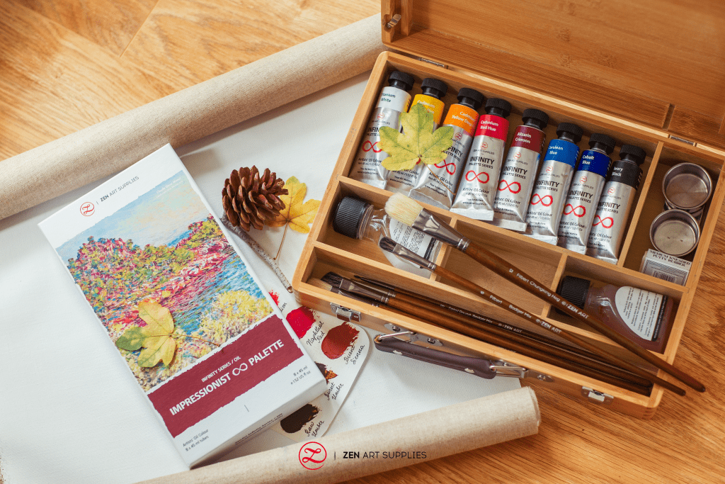
Paint produced with this high quality standard from any reputable manufacturer should give great results when painting in the Impressionist style. However, brands do vary in how they formulate their own paints and there are a limited number of those that are capable of consistent excellent performance when used in a number of Impressionist techniques. The handling quality of oil colors is very important, so you may have to experiment with several different ranges before you find one that suits you and the techniques you wish to develop.
If you are a beginner, fairly decent results can be achieved from the cheaper paint ranges meant for students and leisure painters, and you might feel more at ease practicing and experimenting when using them. But remember, you will always get better results from artists' quality colors. As your technique improves through time, there will come a point where you will start to see the importance of investing in higher quality oil paints. Thankfully, a typical Impressionist palette does not involve too many colors and the cost of buying good paint is returned tenfold by its superior performance and the pleasure you will derive from using it. You really do get what you pay for.
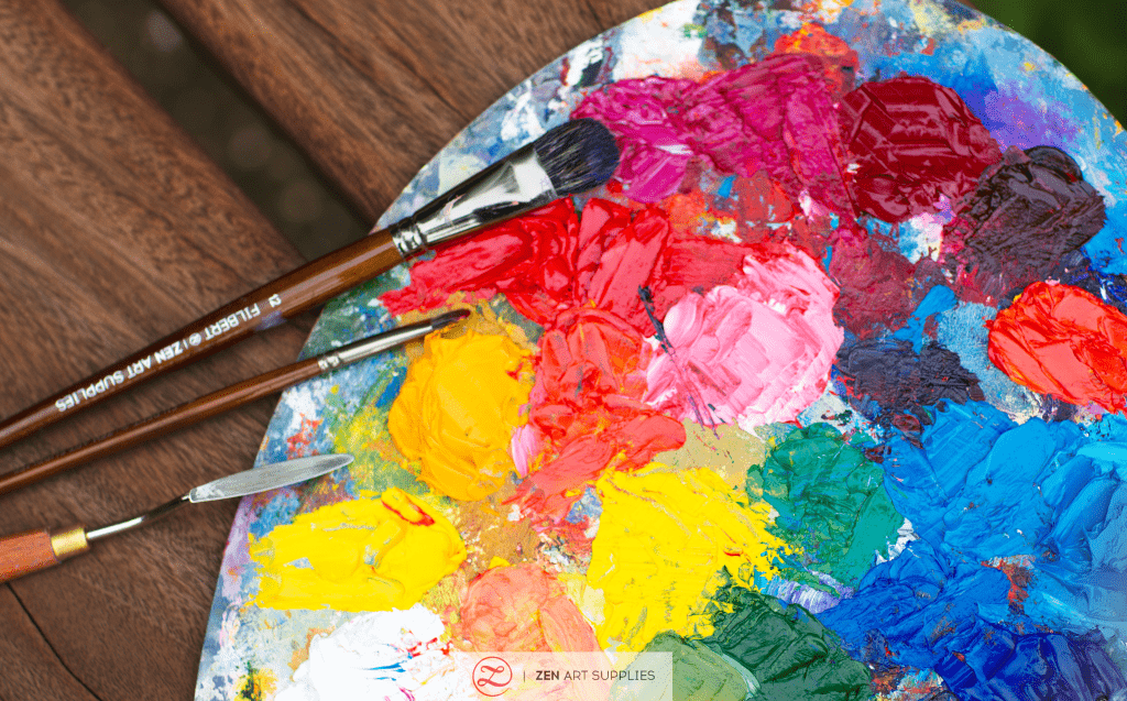
Rainbow Colors
The Impressionists' rainbow palette gave birth to a new technique brought about by the newfound intense study of colour. They have observed the significant difference between the actual colour of the objects and how our eyes perceive them through different lighting and atmospheric conditions. For example: If you place two identical white spheres in two different lighting and atmospheric conditions, - one during sunset on a clear day and the other during a foggy and cloudy day - they both have the actual colour of white, but the perceived colors greatly differ. The sphere during sunset now appears warm with yellow and orange tones, while the other one appears cool with blue or green tones. The colour temperature will vary depending on many factors such as the position of the sun during the day, the clarity of the moon at night, artificial lighting conditions, the different seasons, the different weather conditions, and the quality of the atmosphere that the light will be passing through. All these will affect how we see the colors of the objects before us.
The three following paintings below by Camille Pissarro are great examples of this:


Understanding the Impressionist's colour theory is the first step. Now, let's get into the colors- both new and old - of their palette. Below is a selection of colors that could be used in modern versions of the Impressionists' rainbow palette. More than half of these were actually used by them, while the rest are present-day alternatives that have directly replaced some of the colors shown here that you might want to use. Basically, the Impressionist palette contains bright values of blue, yellow, red and green, plus the Red Lake and White.
Blues
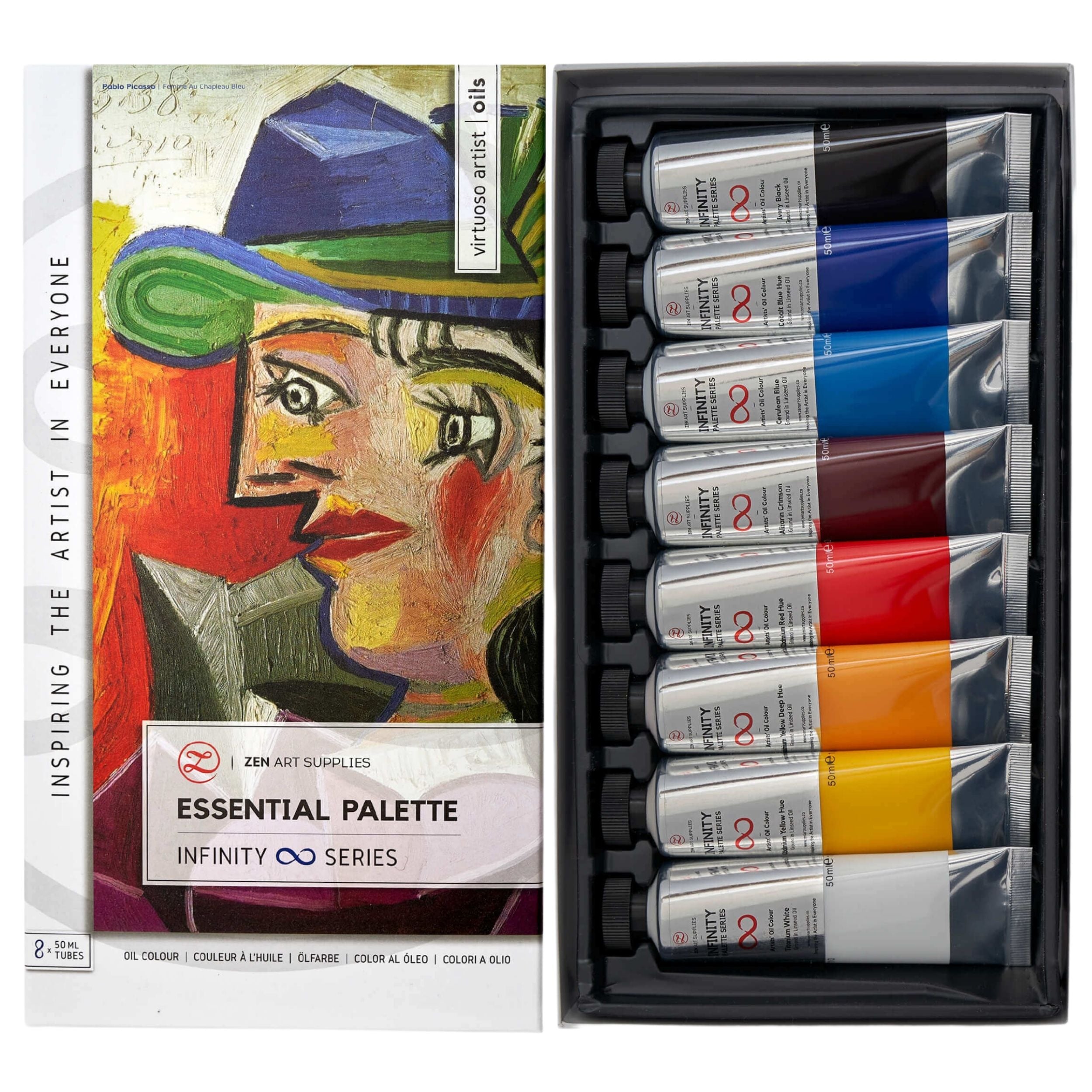
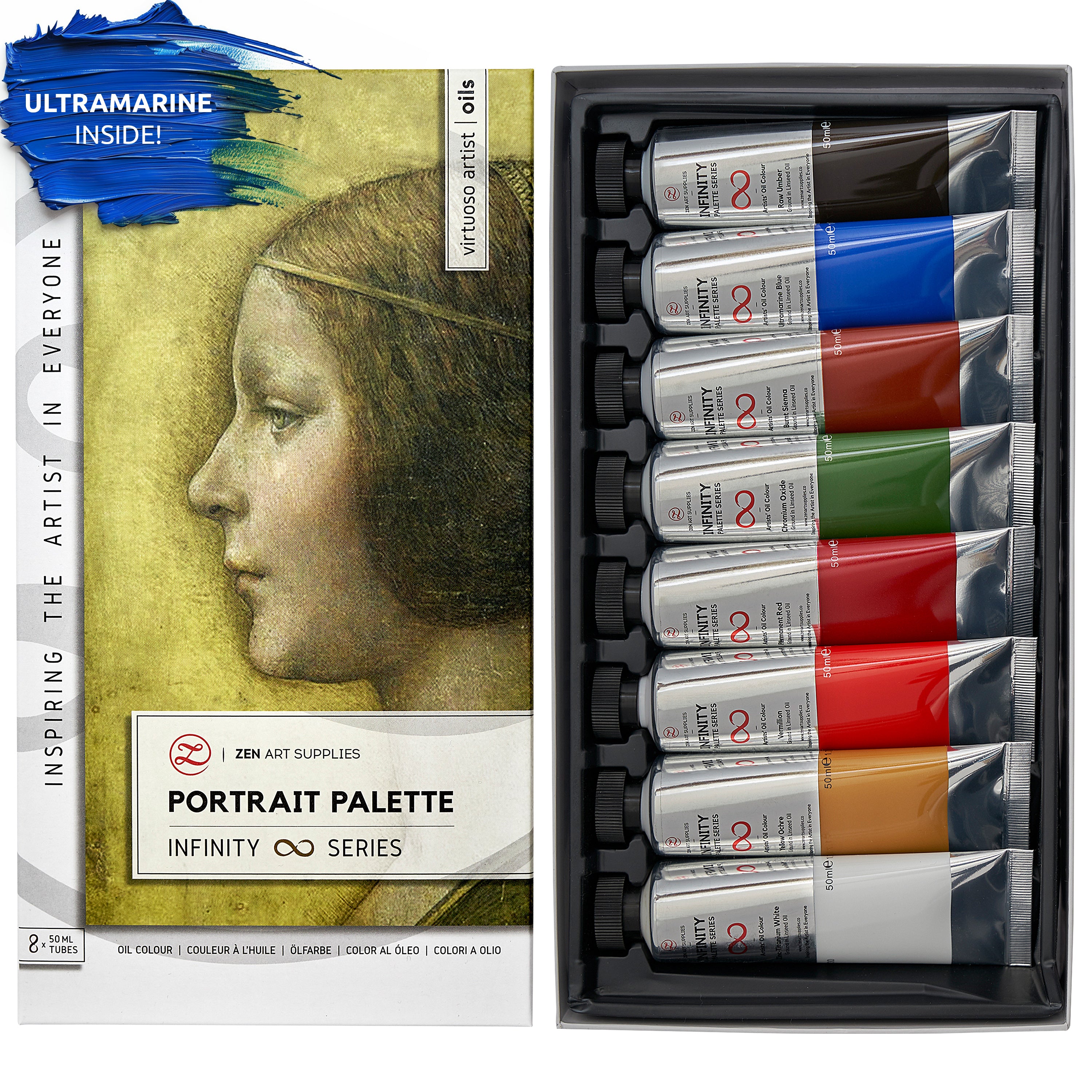
French Ultramarine is a synthetic version of the traditional pigment called Ultramarine, which was made from grinding the semi-precious lapis lazuli stone into powder. It was considered to be top-notch and was the most expensive blue at the time. Artificial Ultramarine became widely available in France after 1828 when a prize was offered and was won for the discovery of a method to produce a less pricey pigment. French Ultramarine is a strong mid-blue and was used a great deal by the Impressionists.


Cerulean Blue - a delicate greenish blue - was first used by Rowney in 1860 as a watercolour and can be seen as an oil colour in French Impressionist paintings from the 1870s onwards (particularly in the works of Monet, Morisot and Manet).
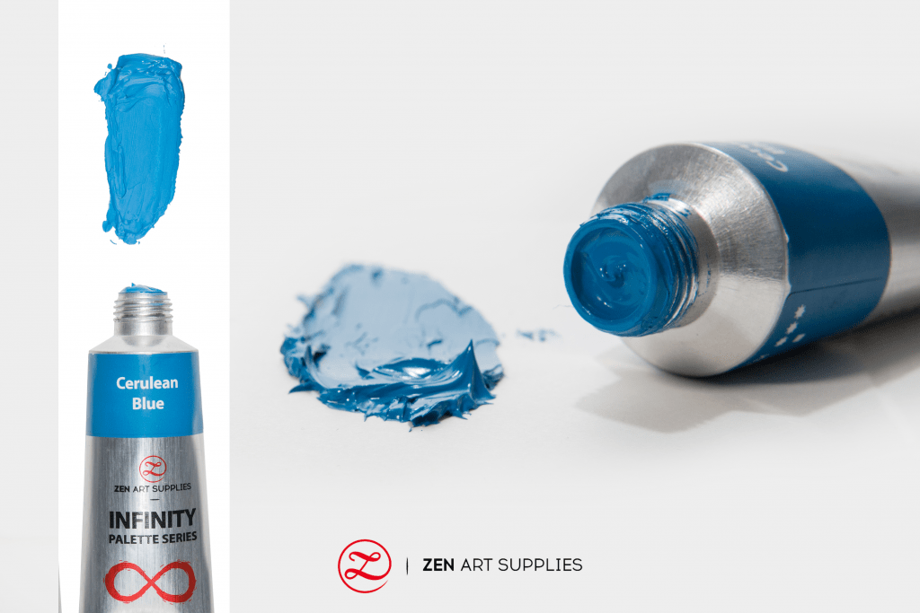

Cobalt Blue was discovered in 1802 and was introduced soon afterwards. The Impressionists used it a great deal. It is also a rich mid-blue and has shade variants that come close to Ultramarine, but it often tends towards green and makes the most beautiful tints with White. Cobalt Blue dries quite well, a valuable property to have in oil paints. It should always be on your palette as much as possible, but make sure that you have the real Cobalt Blue and not merely an imitation of it.


Yellows
Cadmium Yellow is a fine yellow that appears in lemon and deep yellow varieties. It also comes as a mid-yellow variant that is closely related to Cadmium Orange. The impressionists initially used the Chrome Yellows because they were cheaper and came in many shade variants. They were slow to adopt the Cadmiums, which became available in the 1840s, possibly because they were expensive and less popular with French colour-makers, but from the late 1870s and onwards, the Cadmiums replaced the Chromes.
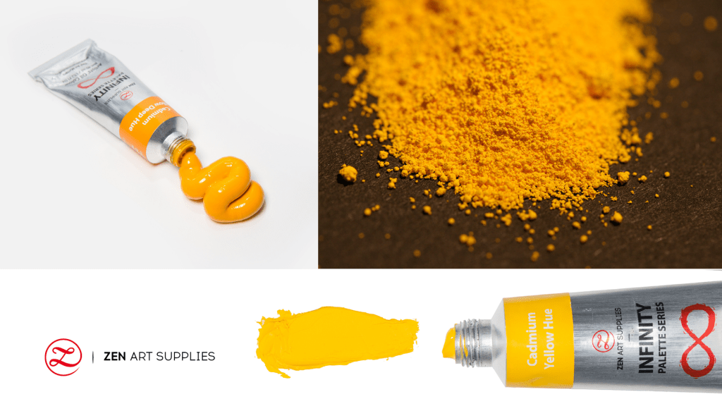

The Chrome Yellows are still available, but the Cadmium pigments are generally considered to be much better. The mid to deep yellow values of Cadmium Yellow that tend slightly towards orange are generally the most important ones to have on the palette. The Impressionists used an opaque Lemon Yellow with a greenish tinge, but the pigments used for this value are no longer available. The closest reasonable substitute is Hansa Yellow Pale and is found in most oil paint ranges, but is often marketed under a brand name.


Reds
Vermilion was originally made by grinding the mineral cinnabar into powder. It was the only useful and reliable bright red that was available at the time to the Impressionists and remained the primary red in their rainbow colour palette until the 20th century. It has since been replaced by Cadmium Red, a safer synthetic pigment with very similar properties. You should use one of the lighter, brighter values such as Cadmium Light Red, Cadmium Scarlet or Cadmium Vermilion for the most part. Nowadays, several modern organic pigments already offer possible alternatives to the bright reds, but the Cadmiums are found to be generally more reliable.


Greens
Viridian is a transparent emerald green version of Oxide of Chromium and was featured on the original Impressionists' palettes. It is a dark shade of green that is between teal and green in the colour on the colour wheel. Chrome Green and a very vivid Emerald Green that the French called V'eron`ese Green were also used. The colour name still exists, but the original highly toxic pigment it is derived from is no longer in use. It can be mimicked by creating a mixture of Hansa Yellow Pale and Phthalocyanine Green. There are numerous other modern blended greens to choose from like the Permanent Bright Green. Mixed greens can be useful especially when speed painting but are not strictly necessary if you want to keep your palette with just the minimum colors ala Impressionist's rainbow palette.


Phthalocyanine Green is a synthetic green pigment that is usually sold under a brand name, but it is worth having on the palette even though it is fairly close to Viridian. Both are transparent emerald greens, but Phthalocyanine Green is sharper, more intense and more transparent - such characteristics make it very useful when creating your mixtures.

Red Lake
Red Lake, qualified as Deep or Rose, is used to refer to a group of colors that occupies a range of values roughly between red and purple which encompasses rich to transparent colors. The original pigments in this group were Rose Madder, Carmine and Indian Lake. They were extracted from organic matter such as plants or insects and could be produced in many shade variants - as many as 30 different Red Lakes were offered as oil colors by the French colourman Lefranc, alone, during the 1870s.

Around this time, synthetic dyes such as Alizarin also started to be used in Red Lake pigments. The different Red Lakes are not easily distinguishable from each other in paintings, and so it is difficult to dissect each Impressionist's preferences. But what matters most is the function they served and which of today's Red Lakes would be a suitable choice for your own works.

The essential Red Lakes are the oil colors ranging from bright rose pink through crimson to a deep purple red. Dark shades of red violet or crimson tinged with brown may also work equally well. The rose pink to crimson varieties when mixed with White give beautiful tints which might be used for painting flowers, or to add a tinge of rosiness to the delicate complexions of young women, or children. Used in their pure forms, the deep Red Lakes provide a dark shadow tone for strongly lit landscapes, but the most important function of any Red Lake on the Impressionist palette is its vital contribution to colour mixtures.

Red Lake mixed with Blue makes Purple. When added to Green, darkens and dulls the colour, capable of producing an approximation to Black. But if White or Yellow are present, gives broken Greens with muted values. Mixing a large amount of White, Red Lake plus Blue or Green, or both, in varying proportions, creates coloured Greys. The greying effect of such combinations also helps to produce impure colors for use as intermediate values. So Yellow and Red Lake might give an Orange that when mixed with White and a tiny amount of Blue becomes more like a Yellow Ochre or Raw Sienna. Adding Green instead of, or as well as, Blue, produces a different version of this shade.
Red Lake is almost always the red for mixing on the Impressionists' rainbow colour palette because of its translucent nature. A brighter and more opaque red, such as Cadmium Red, produces dull, flat and often muddied-looking mixtures and is generally used only as a pure red, or in a pink mixture. There are, however, two things to keep in mind: firstly, you must use Red Lake wisely or you can end up with very dirty colors just like that, and secondly, with one exception, Red Lakes become less and less permanent the further that they are reduced in mixtures.
Six modern Red Lake colors are alternately based on Alizarin and Quinacridone pigments. Alizarin is a synthetic version of one of the components of Madder, an important traditional source of Red Lake. Alizarin pigments probably occur in the original Impressionists' paintings and are still widely used these days. They are cheap and commonly employed, but remember, at the low levels used in this type of colour mixing - where a small addition is used to 'break' another colour - they are not permanent. A more permanent version of Alizarin Crimson has recently been introduced and might also prove suitable or might even be an alternative depending on your preference.

The more recently introduced Quinacridone pigments are more expensive but are deemed to be a better choice. Quinacridones usually appear under brand names or are more familiarly referred to as Permanent Rose or Permanent Magenta.

Whites
Lead White or Flake White was a colour long used by artists even before the Impressionism art movement. This pigment is a compound of lead and therefore accelerates the drying time of oil. White Lead either on its own, or with any colour mixed with it, will be nearly dry in two days even in thick applications. In the heat of summer, chances are it will be dry by the third day.

Rapid drying is certainly very valuable in Impressionist painting, especially when using heavy impasto effects - thickly applied paint, usually with deeply scored brush-marks - that quickly dry and create a coarse surface texture that can be built upon in a relatively short amount of time. Allowing for a short interval between painting sessions will allow you to work on your next layer over a dry lower layer, which gives a completely different painting experience in comparison to attempting to add colour onto thickly applied paint that is still quite wet. There is the danger of unintentionally muddying the colors of the different layers of your painting together. Painting on a previous layer that is dry or semi-dry is more practical.
This property of Flake White makes it very ideal for Impressionist painting styles in oil. A slower drying White can be substituted only where the paint is applied once and not to be touched again, or when a considerable amount of time has passed between painting sessions. Though the Impressionists had access to the less opaque Zinc White, they did not use it very much. They may have inadvertently used it as an ingredient in some of their premixed pale colors, like Pissarro who actively sought these colors to which he may have become familiar with in Britain.

These days, Titanium White is another White that is also regularly used. It is more opaque and is a brighter white than Lead White. It takes longer to dry than Flake White in oil, but much less time than the slower drying Zinc White, making it very useful for extending wet-in-wet working times. Titanium White is a better pigment than Flake White and can even replace it in Impressionist technique at times. For example, when painting a portrait in oil, Titanium White or Zinc White can be used for achieving various pale flesh tones. Since Titanium White has great opacity, it can quickly lighten the colour that is mixed with it. While Zinc White is more transparent and is great for keeping the vibrancy of the colors mixed with it, most especially when mixing with similarly transparent colors. Depending on the effect you want to achieve, your choice of White makes a big difference. It's best to test out your different Whites mixed with a variety of colors so you can see the different effects and choose accordingly.


The Impressionists would have most probably used the best Lead White paints available at the time in their rainbow colour palette('Blanc d'Argent' and 'Blanc de Krems' or 'Blanc de Cremnitz'). Several versions of Lead White are still being sold nowadays by some modern manufacturers, even though it is considered an old-fashioned pigment, and is sometimes avoided because of its toxicity when ingested through the mouth, the skin or by breathing the particles in. But this is easily remedied by wearing gloves and making sure it doesn't go anywhere near your mouth when in use. Lead Whites today are significantly different from each other and may even vary from tube to tube. Finding one that is heavy, but has an easily workable consistency is best.

Alkyd White is a modern fast-drying formulation made with an oil-modified alkyd resin in place of oil. It can be used on its own or mixed with ordinary oil colors to help speed up the drying process. The main attraction of alkyd based oil paint is the speed in which it dries, as fast as touch-dry in 24 hours when painted in a normal thin layer, this is certainly useful if you want to apply several layers of oil glazes. Just remember that the pigment loading of alkyds is lower than that of good oil colors.
Whichever White you use, you might need to alter its handling qualities according to the style or technique that you decide to use it for. It is said that the Impressionists removed excess oil from their colors by standing them on blotting paper before using them. But, a too tacky and immobile White can be worse than an overly oily one. The Impressionists' Whites were mostly ground in poppy oil, which yellows less than linseed as years go by, but in the long term can be prone to cracking. It also gives paint a soft, buttery consistency, so the Impressionists' Whites were probably thick, but easily spreadable.
Other Important Colors

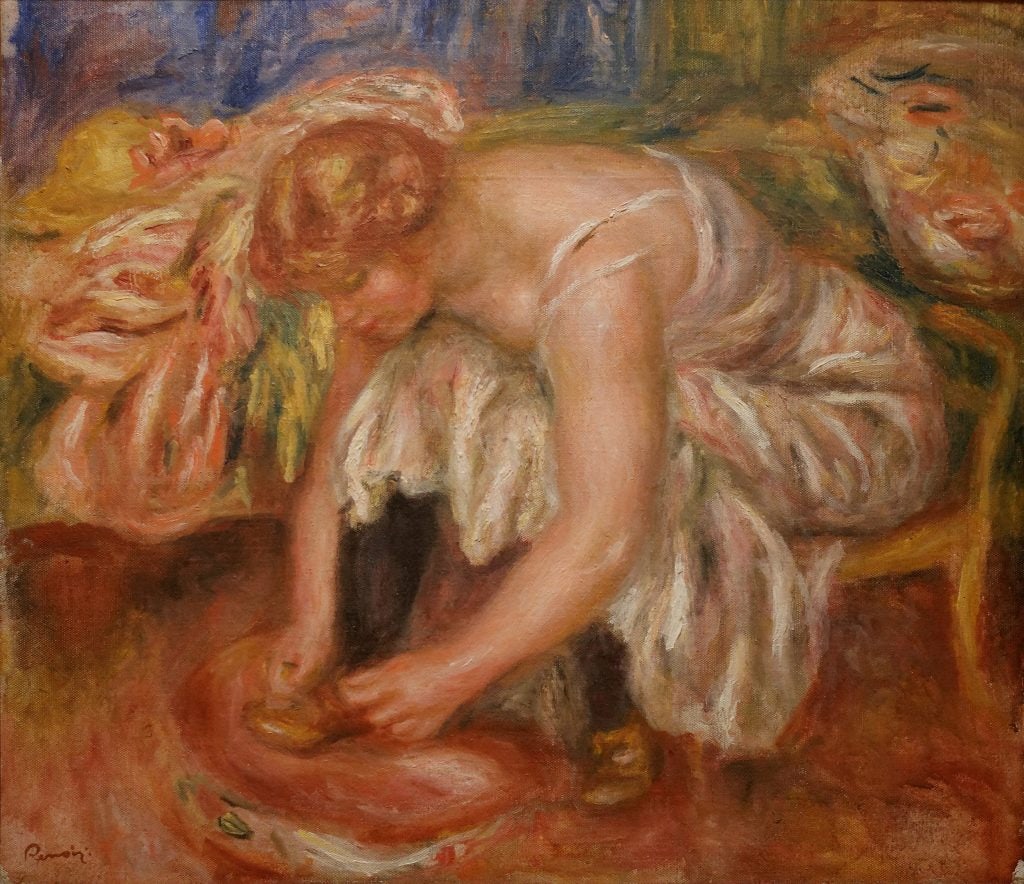
The other rainbow colors you may also want to use are the Cobalt and Manganese Violets which were available to the original Impressionists having been used by Monet and Renoir, and are still both in use these days. Dioxazine Violet, a modern colour that's sold under different brand names, is also another alternative.


Contrary to popular opinion, the earth colors and the Blacks actually do feature on the Impressionists' palette. They used Ivory Black oftentimes, the least potent and the most transparent of the Blacks, it was originally obtained from charred ivory that's been ground into powder. They would generally use it with other colors mixed in to add depth to the colour. Nowadays, its pigment is similar to Bone Black which is sourced from charred animal bones. Another Black alternative is Lampblack, a pigment made from soot produced by burning oil in lamps, and the burning of other fuels like gas, fats, asphalt, paraffin, and resins.


Yellow Ochre, Red Ochre, Raw Sienna and Burnt Sienna are likely to be used more than the Umbers in an Impressionist's rainbow palette. But it's still wise to have them on hand for those instances where you're looking for natural and dark brown colors for your painting.


I'm hoping you found this as interesting as I did when I first encountered the rainbow colors of the Impressionists. Thanks to historians and scientists, we can create an approximation of their colour palettes and make modern Impressionist paintings of our own. You can start by copying an Impressionist master's painting style as an inspiration, then as you become more comfortable with the different techniques, make one in your own original style. It's important to enjoy the process, so keep yourself from overthinking and have a great time exploring!
If you're curious to know more about colors and their meanings, have a look at these following articles that dive into the different histories, symbolisms, and their uses in art - What Does The Colour Blue Mean?, What Does The Color Red Mean?, and What Does The Colour Yellow Mean?
What are the colors you normally have in your palette? Do you have a colour palette similar to the Impressionists? Which new colors are you planning to add to your palette? What future content would you like to see from us? Let us know what you think, we'd love to hear back from you. Feel free to leave a comment, and we'll be happy to answer any queries you have.
For our next one, learn how to use the colour wheel to your advantage in Creating Fabulous colors With Oils. Until then, enjoy your creative journey!
- MEET THE AUTHOR-
Ardak Kassenova is a London based contemporary artist, co-founder and creative director of ZenART Supplies. Her visual style-contemporary impressionism-share similar aesthetic qualities with those by the French Impressionists. After 20 years of a successful corporate career, becoming a mother to two wonderful girls, and with the continuous development of her practice by taking private lessons from the best artists she could find; Ardak decided it's time to align her life with her true passion, Art. Driven by this passion and her corporate leadership background, she co-founded ZenART.
"My heart and soul were always with Art, and since my childhood as long as I remember myself, I was dreaming to be an artist. I was painting after work, when I had time, and teaching myself through the books, videos, visiting art galleries and museums. I've been very curious about different techniques and styles, and therefore accumulated knowledge and experience on a variety of mediums."
Read more about Ardak Kassenova in this feature. Say hello to @ardak_zenart on Instagram!
Source: Paint with the Impressionists: A step-by-step guide to their methods and materials for today's artists, by Jonathan Stephenson, 1995


