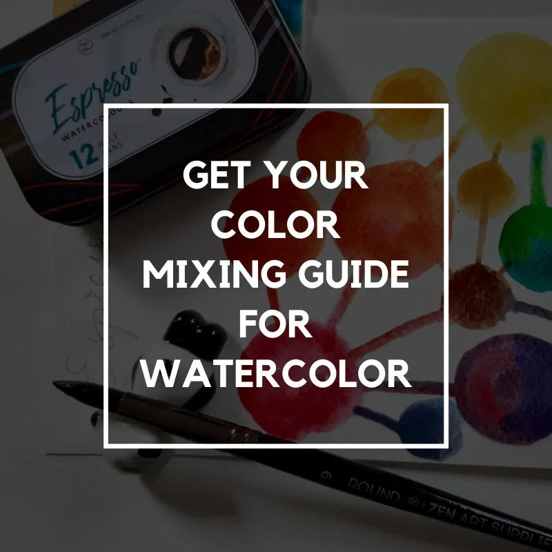
How keeping a record of your color mixes help you keep track of your color combinations and mixtures
Sketchbook journals are used for all kind of purposes. I've used them for more than 30 years. What works best for me is to have a separate journal for different purposes.

However, my favorite journal stays in my studio where I can find it when I need it. When I have an idea for a new piece of artwork, I sit down and write about it in my studio journal along with what I hope to accomplish. I try not to think about it and let my subconscious tell me what it should be. Sometimes I get in the groove, and sometimes I don't. Still, whatever I write helps me organize my thoughts.
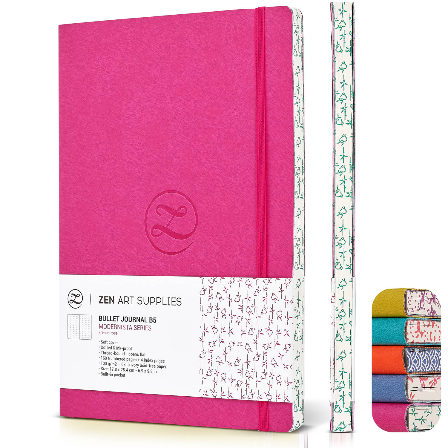
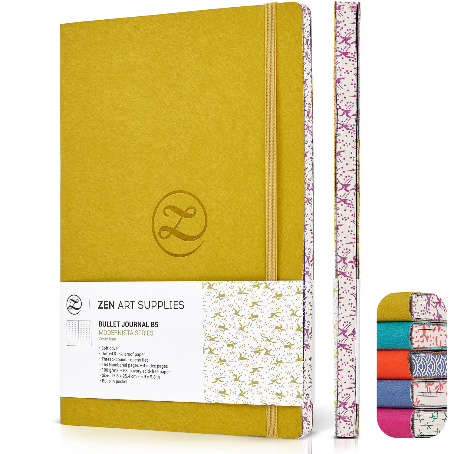
I use my studio journal to do some preliminary sketching, to take a closer look at composition and values, and keep track of color combinations I come up with.

The tagline for my art is, 'it's all about the color', and I use my studio journal to record colors and combinations I like and dislike. I keep records of which paints I have in my supplies, record color mixes, and how I arrived at them.
Keeping a record of your color mixes in your studio journal is key
I paint a lot of abstracts and often use colors right from the tubes without mixing them. I like the vibrancy of colors - especially reds, oranges, and yellows - I rarely use titanium white or carbon black.
But only using paint from the tube is limiting yourself to a finite selection of colors. Phthalo Blue (Red Shade) is going to look pretty much the same no matter which manufacturer you choose. When you begin mixing colors, you begin to develop your own color palette.
In addition to being a good art practice, many artists over time developed their personal color palette and style that helped them become well known and successful. Let's take a look at two artists who made a (good) living with their art.
Anatole Krasnyansky (1930 - )

Krasnyansky developed a watercolor technique that incorporated pieces of paper to add texture. Born and raised in Ukraine when Russia was still the U.S.S.R., he emigrated to the US in 1975. He has degrees in fine art and architecture. Here are abstract images that are identifiable, but the whole composition is extraordinary. Can you find the duck in the first image?
Gustav Klimt (1863 - 1914)
Another artist with a consistent color palette (that included real gold) is Austrian artist Gustav Klimt. The first painting is of Adele Bloch-Bauer. She was married to a rich industrialist and was Klimt's mistress and muse. Many of Klimt's paintings feature her.
The painting after that is called The Kiss. It is the most well known of his work. The Kiss is so popular that it has been used commercially in all kinds of ways - clothes, calendars, coffee mugs, coasters, and key chains, to name just a few. Klimt tended to create additional paintings based on one of his paintings. It might have a different background or ornamentation on a dress. This way, one painting could turn out to be multiple paintings of the same subject.


Of course, each of these artists' particular style of painting helped with their notoriety. I admire these artists for their color palettes, style, and talent, especially.
A studio journal will help you keep track of all of the combinations you create
Once again, your studio journal is the key. Here's one of the pages in mine.


At the top of the left column is a blue color I mixed. I made it with Anthraquinone Blue, Prussian Blue, and Cobalt Teal. Under that I put a sample of each color I was going to use in my effort to create a green that would work for one of my paintings. From the top, under My Blue is Phthalo Blue (Red Shade) - PBRS; Cadmium Yellow Light - CYL, and Hansa Yellow Medium - HYM
At the bottom of the left column, I mixed four greens from Phthalo Blue (Red Shade) and Cad Yellow Light by using different amounts of blue or yellow. The second one has Iridescent Gold Fine mixed in.
In the centre column, I used the same blue - Phthalo Blue (Red Shade) - but switched the yellow to Hansa Yellow Medium. Even though the two yellows are distinctly different, I think the greens I made are similar to the mix in the left column. They may be a little bluer. I like the three combinations where I added Iridescent Gold Fine.
Take Away
Keeping a studio journal handy where you can record information and studies of subjects will help immensely with your growth as an artist. Instead of having a bunch of notes stuffed into a drawer or envelope, put them in your studio journal (glue or tape pages when needed). Then you can find what you need without searching.
u2014 MEET THE AUTHORu2014

Ardak Kassenova is a London based contemporary artist, co-founder and creative director of ZenART Supplies. Her visual 'contemporary impressionism' share similar aesthetic qualities with those by the French Impressionists. After 20 years of a successful corporate career, becoming a mother to two wonderful girls, and with the continuous development of her practice by taking private lessons from the best artists she could find; Ardak decided it's time to align her life with her true passion, Art. Driven by this passion and her corporate leadership background, she co-founded ZenART.
'My heart and soul were always with Art, and since my childhood as long as I remember myself, I was dreaming to be an artist. I was painting after work, when I had time, and teaching myself through the books, videos, visiting art galleries and museums. Iu2019ve been very curious about different techniques and styles, and therefore accumulated knowledge and experience on a variety of mediums.'
Read more about Ardak Kassenova in this feature. Say hello to @ardak_zenart on Instagram!


